Jessica Silverman Gallery | California-based galleries and artists get ready to make their mark on Art Basel Miami | C Magazine
“California-based galleries and artists get ready to make their mark on Art Basel Miami”
C Magazine
December 2014
PDF
Hayal Pozanti | Interview | Studio International
“Interview – Materials and processes are pushing the boundaries of what constitutes a painting physically”
Studio International
Written by A Will Brown
November 11, 2014
PDF
New York-based painter Hayal Pozanti talks about her invented alphabet, working with digital media, and her belief that eventually paintings will be viewed and experienced through screen technology such as Google Glass…[DDET read more]
Hayal Pozanti, who was born in Istanbul in 1983 and moved to New York in 2009, is an artist who works in painting, sculpture, collage and digital animation. Her work explores the relationship between new media technologies and the originality of the handmade through a vibrant yet meditative abstract pictorial language, conveyed through a unique alphabet of letters, or symbols, that Pozanti created.
A Will Brown: What are you working on in the studio? Do you have new directions in your work, or exciting bodies of work coming up?
Hayal Pozanti: I am working on a new series of paintings based on overlapping combinations of letters in my invented alphabet. I’m very excited about these because I feel they unify my interests in tactility, generative composition and conceptual colour combinations, particularly in reference to everyday consumer objects.
AWB: You’ve talked about moving away from the appropriated towards making your own, new language or symbols. Do you see yourself ever returning to a process of appropriating images and motifs?
HP: I’ve never lost interest in collecting images. Nowadays, these act as inspiration rather than a direct resource. So, in a way, one could say that I still appropriate conceptually but not materially.
AWB: What are some of the most exciting or engaging projects or exhibitions you have been a part of?
HP: I recently returned from the opening of the New Orleans Biennial where I have five works on display. I met a lot of wonderful artists, curators and writers during my time there. It was an invigorating and refreshing experience. Other than that, I will be launching a set of inflatable light fixtures with Studio Voltaire in London for its Christmas benefit sale. I have also taken part in AllGold at PS1, Museum of Modern Art, with a text piece. For that particular work, I edited and reconfigured a selection of tweets from my collection. It’s a sound piece that mimics the voice of an elderly woman slowly articulating an amalgam of contemporary concerns that confronts humanity today.
AWB: Does seeing your work outside the studio, in an exhibition or a home, change it dramatically for you? I’m interested in flexible interpretations here and how an artist’s initial impetus may become muted, or enhanced, by changing surroundings. This has particular resonance for me when looking at your work because it is abstract and symbolic, yet uniquely so.
HP: It depends on how much time has passed since I’ve made the work. If it’s been a few years, there’s a suspension of belief where I think back to all the precise decisions I made at the time. There is a very logical thought process to the way I make things and it’s interesting to remember all the details step by step. It’s like looking at the source code for a web page or an interface. Outsiders see the end result, while I instantly see a scroll down of commands. If it’s part of an exhibition, I look at the other work in the show and try to find the common thread that connects my work to the other ones. The same is true when I see it in a collector’s home. Both instances allow me to look at my work more objectively, and analyse what it might mean to others. If it’s more recent work, I tend to skim over it because I’ve already overanalysed it and am not ready to confront it objectively.
AWB: What kinds of places do you go to in order to think and find new elements of your paintings? Essentially does your process involve more of an introverted schematic, or are you more extroverted and outwardly gazing?
HP: It’s a combination of both. I enjoy observing the world with an anthropological perspective. I analyse how humans engage, react and adapt to developments in technology. I absorb a lot of information regarding this theme, both in terms of theory and also through daily culture. I think through and interpret these ideas to make connections in an introverted manner. I strive to make art that reflects and comments on these observations without being literal.
AWB: Do you go to exhibitions regularly? What have been some of the most interesting that you have been to recently? What, in your mind, makes a great exhibition – at a gallery, museum or independent space?
HP: I do visit exhibitions regularly when I can, yes. I also catch glimpses of a lot of shows online. I think a great gallery exhibition is one that requires you to be physically present to fully grasp the ideas. I don’t mean this in the sense of an all-out entertainment experience, but there has to be something that the screen can’t provide.
AWB: Can you tell me about the process of making a painting for you, maybe through one particular work?
HP: For the past two years, it’s been a process of back and forth between the analogue and the digital. I would make a hand sketch, then place it in Photoshop, work on it on the computer using my trackpad, place that sketch on a panel, and work on it physically for a while, then put it back in the computer ad infinitum until I’m satisfied that the composition looks satisfactory in both physical life and also on the screen. For the latest paintings, I’ve created a set number of compositions that generate shapes by overlapping individual characters from my alphabet. They are more straightforward in composition and incorporate aesthetic sensibilities of everyday consumer objects.
AWB: Do you think of yourself as making a kind of visual language, or a set of signs that identify particular ideas, objects, people or places? Tell me about the visual language you employ and how that evolved for you.
HP: For several years, I’ve been investigating the idea of original content. It began when I asked myself how an artist could create a unique and universally recognisable visual language within an infinite image realm: the internet. The idea of immediate recognisability within the image economy, and the value that this creates on the physical object, have been my primary interests. In order to pursue this idea, I came up with a literal alphabet of shapes that I use to make my work. The final edit contains 31 characters. No final shape must resemble the previous shapes, and no shape must reference any object in the world. Painting, in this sense, is only a means of creating information vessels that disrupt the flow of images.
AWB: I see a lot of study and interest in sculpture in your work. Are you interested in making sculptures, or objects, or have you made some in the past – works more sculptural than your cut-out works.
HP: Yes, I am, and have made some before. I will start working on some for my forthcoming show at Jessica Silverman Gallery.
AWB: Can you describe, and tell me a bit about, a few paintings? I’m interested in Unhosted (2014) and Twitter, Only With Fur (2014). These works reference internet-based mechanism and applications. Can you explain the relationship?
HP: The titles for my work come from the stream of my Twitter feed. They have no literal relationship to the work itself and I only assign titles after I have completed the work. My Twitter feed comprises blurbs I come upon as I read about topics that interest me. The sculpture paintings themselves are purely abstract. They could be described as paintings of abstract sculptures that are not yet realised.
AWB: What is coming up for you in the near future?
HP: I will be showing some videos at Art Basel Miami in December. I will be having a solo show in February at Jessica Silverman Gallery in San Francisco. After that, in November 2015, I will be presenting work at the Aldrich Contemporary Art Museum in Connecticut.
AWB: What do you think are the most important things happening in painting at the moment and is painting undergoing any big changes that you think are of note?
HP: Due to rapid technological advancement, many materials and processes are pushing the boundaries of what constitutes a painting physically. A lot of artists, including myself, are exploring laser cutting, 3D-printing, developments in digital printing on varied materials, and incorporating industrial materials into paintings. It’s a very exciting time to be making art. I foresee the future of these explorations will lead into a more spatial exploration of painting through virtual reality and simulation technology. I think painting will finally be able to fully incorporate the notion of time into itself by creating experiential paintings that can be viewed and experienced through screen technology which becomes one with our eyes (ie Google Glass/lenses) or everyday virtual reality simulators such as the Oculus Rift.[/DDET]
Susanne M. Winterling | Drift | Parrotta Contemporary Art
“Drift”
Parrotta Contemporary Art
Augustenstrasse 87-89
70197 Stuttgart
December 5, 2014 – February 14, 2015
Press Release
»Drift« is a series of works that focus on solidarity, empathy and immersion. These are material forces that make social life be- come real. It is through our bodies and on the basis of how we live, that we make sense of these images we constantly immerse ourselves in; images we relate to and images we are alienated by. There may not necessarily be a simple logic to what triggers our responses, they are much rather part of process in which subjectivity is rendered precarious, in political and economic terms. What is refracted (rather than merely reflected) in the process of immersion, is the collective production of subjectivity, the everyday life of a community. These dynamics of refraction, however, not only manifest themselves in our relation to tech- nologies like screens or microscopes or surfaces like retina displays, skinlike photopaper or shiny aerogel but also in activi- ties like sleep and the ways we interact with animals, plants and inanimate matter in the ecological systems we live in…[DDET read more]
»Drift« proposes metaphors for these dynamics of refraction. It foregrounds the tactility of images and looks at bioluminescence, the ability to produce (not just to reflect or store) light, found
in many creatures, mostly living in the sea. Among them is a particular form of plankton, the oldest species matter of our planet. Like a living touchscreen, this plankton embodies most elementary principles of touch, spectacular visuality and poten- tial toxicity. In Drift, working with the camera, microscope or telescope, becomes an attempt to empathize with biological life in ways that reach beyond the horizon of human society.[/DDET]
Hayal Pozanti | Disorganized Disorder | Daily Metal
“Disorganized Disorder”
Daily Metal
Written by Sarah Mendelsohn
November 7, 2014
PDF
There’s something completely fascinating about the artwork of Turkish born, New York City based artist, HAYAL POZANTI. Her paintings feature a variety of different colored shapes, twisted and turned in ways that are never consistent throughout her many works. Despite the combination of imperfect geometry her paintings feature, they still appear orderly. Their lines are perfect as are the artist’s brush strokes. Her attention to detail is clearly immaculate. That comes through in conversation with her as well, she is clear in expressing her opinions, inspirations and motives. When describing her work, it quickly becomes apparent that Pozanti’s perfectly painted squiggles are more than just that…[DDET read more]
How did you first garner interest in art? Is it something your parents supported? Why did you decide to become an artist?
There’s no specific moment I can point to. I’ve been making things since I was a baby. My parents have always been very supportive. They noticed my inclination towards visual art at a very early age and have guided me in pursuing it. I feel extremely lucky in that sense. I did not make a conscious decision to become an artist. I had some things I wanted to say and the way I said them turned out to be art.
I see you were born in Turkey and also studied there. How has growing up in and studying in Turkey affected your artwork?
My undergraduate art education in Turkey was conceptually driven. I was encouraged to disregard the object and focus on my ideas. This has given me the rigor of thoroughly questioning why I make the things I make, what they might mean and why it’s necessary that I make them.
Do you see a huge difference in the industry there versus the American art world?
I don’t think I would use the term industry for any context related to art, but if you mean comparing the two art worlds, I would say they are pretty much similar. There are fairs, biennials, museums, galleries, collectors and artists. Of course, the American art world dwarfs the Turkish one in terms of the market and funds, but that is an economic reality, which only mirrors the larger one.
Where do you find inspiration for your work? Take me through the process of creating a painting.
I question and analyze how technological progress effects creativity, consuming habits and physical presence in the world. For several years I’ve been investigating the idea of original content. It began when I asked myself how an artist could create a unique and universally recognizable visual language within an infinite image realm: the internet. The idea of immediate recognizability within the image economy and the value that this creates on the physical object have been my primary interests. In order to follow this process, I came up with a literal alphabet of shapes that I combine and recombine to generate compositions. No final shape must resemble the previous shapes and no shape must reference any object in the world. Painting, in this sense, is only a means of creating these information vessels.
This is an interesting concept. What are you currently working on?
I have just completed and shipped a group of work for the New Orleans Biennial. Currently, I am spending my time reading, writing, thinking, absorbing information and making connections. Slowly working on some new paintings in the studio to let ideas loose visually. I will soon start working towards my solo show at Jessica Silverman Gallery coming up in March and also a book project that has been on the burner for quite some time.
You create both painted works and digital collages and gifs. Do you have a preference in medium? Do you think it’s important as a contemporary artist to go beyond painting and use digital devices to create art?
I started making art digitally and came to making physical objects and paintings in a roundabout way. Therefore, I can safely say each has it’s own setbacks and advantages. Personally, the beauty is being able to create something that could co-exist in both realms. This is something I strive towards and always consider when making my work. I don’t think it’s important that contemporary artists go beyond painting and use digital devices. It all depends on what you’re most comfortable with and what you’re trying to convey. [/DDET]
Hugh Scott-Douglas | Hugh Scott-Douglas Takes on Amazon.com at Jessica Silverman Gallery | Blouin Artinfo
“Hugh Scott-Douglas Takes on Amazon.com at Jessica Silverman Gallery”
Blouin Artinfo
Written by Francesca Sonara
October 25, 2014
PDF
Jessica Silverman Gallery’s location in the Tenderloin district, an area known for its resistance of gentrification and general seediness, provides a compelling backdrop for Hugh Scott-Douglas’s “Promises to Pay in Solid Substance,” open through November 1…[DDET read more]
Outside, the neighborhood recalls a pre-technology boom San Francisco. Inside, viewers are ushered into the present via the artist’s material exploration of modern economics and new technologies. Happily, Scott-Douglas forgoes multimedia apparati, choosing instead to demonstrate the nuance of digital development through the analog. The series “Heavy Images” (all works 2014) displays hefty billboard prints rolled up on their plywood crates. No longer useful, these obscured advertisements are more representative of the costs or resources required to produce them than the products they initially marketed. Now extraneous, these oversize objects make a strong argument for digital marketing’s renewable nature. Maybe “Heavy Images” is a sophisticated endorsement for Internet marketing, but the show doesn’t let the modality off so easily. Amazon.com presents snapshots of an Amazon distribution center’s surfeit shipping materials. Cardboard boxes and more packing paraphernalia are seen spilling out into a communal hallway in Brooklyn. The commentary on Amazon’s appreciable contribution to waste generation continues outside the photograph: wrapped in plastic, the photos wrapped in the same materials they capture. The resultant work cleverly amplifies society’s continued dependence on systems born of our capitalist tendencies. Even as we shop online to save gas, we send out a fleet of delivery trucks.
Works on wood panels from the “Screentones” and “The Economist” series similarly adopt a language of process in exploration of society’s relationship to new media. Displayed in diptych formation, pictures appropriated from The Economist hang alongside images of debris from the artist’s studio. Before being printed onto the panels, the dust bunnies and journalistic sources were scanned, mapping a circuitous route wherein the tangible begets the digital begets the tangible. And while the “tangibles” in “Promises to Pay in Solid Substance” border on the tedious at times, they certainly serve as a valuable reminder to a city hellbent on “innovation.” Even with the considerable advancements of the past decade, our material world remains a concern.
A version of this article appears in the December 2014 issue of Modern Painters magazine.[/DDET]
The History of Technology | Review | Frieze Magazine
“The History of Technology”
Review
Frieze Magazine, #166
Written by Jonathan Griffin
October 2014
PDF
Hugh Scott-Douglas | Promises to Pay in Solid Substance | LEAP
“Promises to Pay in Solid Substance”
LEAP
Written by Marie Martraire
October 14, 2o14
PDF
In his essay “From Image to Media File: Art in the Age of Digitalization,” art critic, media theorist, and philosopher Boris Groys describes the notion of “original” for digital photographs as no longer accurate. In today’s world of digitized images and virtual means of distribution, digital pictures have rather become copies, often absorbed into an invisible and intangible space—the web—where the notion of original, ownership and authorship have lost their initial meaning…[DDET read more]
Brooklyn-based artist Hugh Scott-Douglas similarly considers questions raised by the immateriality of digital photography in his solo exhibition at Jessica Silverman Gallery in San Francisco. The exhibition features four of the artist’s new or recent series that visually stage different relationships between original and copy, visible and invisible, tangibility and intangibility. Together, the four series investigate questions raised by the materiality of digital photographs, the way these photographs circulate through today’s digital realm, and the value system these images represent.
The exhibition layout comes to underline these explorations while creating complex associations between them. For instance, on each wall, one photograph from “The Economist” series (in which Scott-Douglas appropriated, processed, and enlarged uncredited images from English-language weekly newspaper The Economist) is hung next to another from the “Screentones” series, so close that they almost create a diptych. This pairing seems to suggest a connection between the appropriation and acknowledgement of the media source, and the materialization of Scott-Douglas’s work-making processes through its residues. Perhaps this installation, ironically, comments on the almost non-existent authorship and ownership of images in today’s news media. Yet, Scott-Douglas’s process—appropriating, processing, recording, enlarging—can possibly emphasize his personal attempt to negotiate the currency of the image in today’s society of spectacle. The artist exhibits the invisible, making copying reversible by transforming a copy into an original.[/DDET]
Ruairiadh O’Connell | Control Lapse | Josh Lilley Gallery
“Control Lapse”
Josh Lilley Gallery
44-46 Riding House St, London W1W 7EX, United Kingdom
With works also by: Analia Saban, Anissa Mack. Jesse Greenberg, Kathleen Ryan, Kelly Kleinschrodt, Niali Macdonald, Nicholas Hatfull, and Patrick Jackson
Private view: October 16, 6-8PM
October 17 – November 28, 2014
Dashiell Manley | Interview | Studio International
“Interview”
Studio International
Interviewed by A Will Brown
September 10, 2014
PDF
Los Angeles-based artist Dashiell Manley talks about The Great Train Robbery, explains why he sees himself mainly as a film-maker, and reveals how he forms his ideas and the processes involved in his complex, layered and thoughtful works…[DDET read more]
Dashiell Manley is an artist living and working in Los Angeles, California. He works across a wide array of media – film, video, sculpture, photography and painting – often combining many and sometimes all of these forms to create his unique installations, videos and paintings. His work engages both written and visual language, often through an exploration of current events and cinema.
I talked to Dashiell in 2012 during Art Basel, Miami Beach, where he had a solo exhibition with the Jessica Silverman Gallery at the New Art Dealers Alliance (NADA). Since our initial meeting, Dashiell’s work has been included in numerous group and solo exhibitions and he has undergone some important changes in the studio. I caught up with him recently to talk about his successes, forthcoming exhibitions and ongoing projects, as well as to discuss how he forms his ideas and the complex processes he uses to make his work.
A Will Brown: Dashiell, the last time we saw one another, you were working on a number of projects. What are you up to now in the studio, and what new areas or forms are you working in?
Dashiell Manley: I am working on a new film based on Rules of Civility [a 2011 novel by Amor Towles]. The film itself picks up formally and conceptually where the third scene of another work of mine, The Great Train Robbery (2013) [he is referring here to his film The Great Train Robbery (Scene 3) and his installations The Great Train Robbery (Scene 3, Version A) and (Scene 3, Version C)], left off. This new work plays around with post-production and Photoshop to ponder a digital image’s relationship to and with cinematic space. However, with this film, the accompanying objects will not be framed “paintings”, but rather stained-glass panels. The stained-glass works will most likely be suspended from the ceiling of the gallery and will play with the architecture of the exhibition space more than past works have. While there are some formal similarities between these new stained-glass windows and past works, I have not previously played around in post-production quite as much as I am for the Civility film. I’m spending a fair amount of time working every image (film still) in Photoshop and, as a result, I’ve been thinking a lot more about digital images. Specifically, I’ve been thinking about cutting them up, painting and collaging them in much the same way one would if dealing with printed images on a worktable. This has caused me to go back and think about ideas I was interested in early on, thinking about folders of images on a computer desktop, scrap film footage on the floor, a stack of cast-off doodles and, most importantly, the potential new works represented by these cast-off things.
AWB: What are the most compelling ideas for you today? What kind of things, places, people or ideas do you find yourself drawn to?
DM: Recently, I’ve been really interested in digital space and, more specifically, in how it translates into physical space, which brings me back to a particularly philosophical question: what does the backside of a digital image look like? In addition, it seems like I’ve been going to see every major motion picture recently, and I’ve been thinking a good deal about the films Under the Skin (2013) and Boyhood (2014), which are both quite experimental structurally, at least for Hollywood cinema. My interest in these two films seems to indicate that I am consistently drawn to things that just seem to happen or unfold naturally, although only after the concept, structure, and specific of composition and narrative are put into place.
AWB: Your work is incredibly thoughtful and layered. With so many rich visual and textural references, one could miss a lot, especially if not looking and thinking carefully, which is a great strength as it forces people to slow down and reconsider. Can you explain one project in particular, or break down one series of works, to highlight some of the layers and ideas that go into a piece or body of work?
DM: In my works from the series a.r.c. alphabets – which incorporate film, ink, paint, wood, glass and gesso – I wanted to look at two distinct ideas through, and in, a fundamentally sculptural way to create works that somehow bridged the two ideas. First, I wanted to look at events occurring outside the studio – events that were happening locally, nationally and internationally. I was looking at events with which I had (seemingly) little or no direct relation or connection. The second area focused on events that were happening inside the studio – for example, my experiments with mark-making, ideas and the detritus of my daily production (and while these internal studio-based events were obviously informed by the things happening outside the studio, it was rarely intentional).
For the events occurring in the first category (external events), depicted on one side of the work, and thinking about how they were described, I looked at the ways language can expand and contract. I was looking at the ways it can move from intellectually descriptive to primarily visually descriptive (abstract) and then back again. In these works, each linguistic step, from descriptive to visual, is articulated visually by the addition of another layer of information on to the canvas surface; I add another sequence of images superimposed on top of the latter. What ends up being a visually complicated image is reflective of a very simple process. I superimpose layers one on top of the next to correspond with the movement of written language from descriptive to visual, and I eventually arrive at something very basic, a single subtitle.
For this series, I used two different alphabets that gave a loose visual and identifiable structure to the piece. The first language was the English alphabet (the letters a to z) and the second was the Nato phonetic alphabet (alpha, bravo, charlie, and so on). The way I investigated the second areas or external events is a bit more subtle, and less concrete than the first. The compositions for the second side, or second event, have more to do with where language and markings occur in relation to one another as I seek to map the different (sometimes intersecting) planes of the studio (tables, walls, floor). For example, the film images that depict the Nato phonetic alphabet were shot against two and sometimes three vertical planes (walls, canvases and sheets of paper). The images that accompany the text though – that seem to resemble shadow puppets – were conceived and shot on a horizontal surface usually made up of a sheet of glass laid on top of an overhead projector. These were then both photographed – the surface of the overhead projector and the surface of the wall on which they were projected.
From start to finish, the process for producing a single scene is as follows (the asterisks mark the steps that were photographed):
1. A short statement was written based on an actual event.
2. A story was written to accompany that statement.
3. The story was then translated into the Nato phonetic alphabet (a becomes alpha, t becomes tango, e becomes echo)*
4. An image was conceived to accompany the text.*
5. Using the images, the text was retranslated back into English.
6. Using a few rules, the translation was edited down into one or two sentences.
7. The remaining sentences were projected on to a surface, along with the image from step four, on top of the text from the third step, listed above.*
All these projections and overlays took place on a temporary floor that was installed to function as a stage, both in the performative sense and the preparatory sense – a performance stage and a stage of a process. When a scene was finished, wood from the floor, or stage, was used to frame the sheet of glass that was covered by the overhead projector. The first side, the canvas with writing on it, acted as the back of the object, and was mounted on to the sheet of glass. The resulting object is, on the one hand, a strange temporal and spatial document of something else (the film or the events) and, on the other hand, simply a painting. I like to think of the paintings as sentences, and the films as the footnotes.
AWB: How long have you lived in Los Angeles and where were you before? How has the Los Angeles context shaped, or influenced your ideas and your work?
DM: I’ve been in the Los Angeles area more or less my entire life. I was born in Fontana, California, which is about an hour east of LA. Shortly after we moved to Kobe, Japan, for a few years before my dad’s work brought us back to the LA area, to Claremont. I effectively grew up in Claremont, not exactly Los Angeles, but close. I bounced around a bit after high school, but landed at CalArts [the California Institute of the Arts, where he did his BFA] when I was 21. I moved to East Hollywood when I was in my last year at CalArts and I’ve been in LA ever since. Being able to think about Hollywood more as a construct and institution rather than as an actual place has driven a lot of my work over the past four years.
AWB: What are the central concerns, or investigations, at the heart of your work The Great Train Robbery (2013), which was featured prominently in the Whitney Biennial [at the Whitney Museum of American Art, New York] this year? Can you describe the work and the processes of making and conceptualising it?
DM: It is important to point out that The Great Train Robbery (Scene Three) is the first part of an ongoing 14-part project, and while most of the conceptual underpinnings of Scene Three act as an umbrella for the entire project, some parts are specific only to that one scene. First, I have wanted to remake a film for some time. The main function of the Hollywood remake seems to be to showcase the new technology of today, which is a humorous proposition when we consider that technology now seems to progress faster than the time it takes to make a film. I wanted to explore this by making my version of The Great Train Robbery (1903) one scene at a time and to make each scene out of order. By treating each scene as an individual project, I figured I could stretch the entire project over a longer period of time, thus allowing for major technological advances to be immensely apparent. Furthermore, I decided to treat each scene differently: for example, scene nine, which I am currently working on, will look nothing like the scene shown in the Biennial. When the film is complete, the narrative of the original film will still be apparent in its essence, but, formally and stylistically, the film will be completely out of joint – like watching a 1990’s effect-heavy film on a high-definition monitor; the image flattens or expands and many of the effects fall apart.
Second, I am interested in the idea that film locations, or sets, are a kind of fly-by-night operation – they are businesses that operate in one location one day, then in another place the next week. Movies seem to have so little to do with where they are made or the people who live there.
Third, I was interested in multiple takes on a single scene, and this is particular to Scene Three. I am less interested in the moment when the director makes the subjective choice as to which take isthe take, and more interested in the (as I mention above) potential represented by the takes that are not used. I wanted to play with this by making multiple versions (takes) of the same scene, essentially repeating myself three times. In addition to creating takes or scenes, I also thought that this action could play with ideas concerning sculpture and sculptural multiples.
I broke Scene Three of The Great Train Robbery down into five essential actions that all take place in the mail car of the locomotive. The mail car worker enters the frame and works, the robbers enter and startle the worker, the worker is shot and falls, the robbers blow up the safe, and finally the robbers make off with the loot. I broke these down even further into five distinct actions that could be repeated by a performer – me, in this case – in the studio repeatedly. A painting (though at the time of production I considered them as backdrops) was made to reflect each one of these actions. I enter (blue 12 x 12 inch squares), I’m startled and throw my hands up in the air (red rectangles), I’m shot and fall (blue and grey quarter circle), there is an explosion (black abstraction), the loot is removed, which is articulated by an abstract object free-floating in space (red abstraction). The viewer sees these five actions performed three times in the top channel of the work. After the production of the actions, the notes, instructions and detritus from filming are used to write out a series of instructions on the paintings/backdrops. This process is visible in the lower channel of the final two-channel work. Additionally, the instructions were coded in an early-20th century shorthand alphabet chosen not only for what shorthand represents (the attempted mechanisation of the human hand and its possible parallel to cinema’s mechanisation of the human eye), but how the marks appeared to resemble glyphs.
When production was complete, I had three sets or scenes of work, each consisting of five object/painting/backdrops, and I also had around 40 running feet of metal scaffolding walls. When the work was first exhibited in the spring of 2013, it was shown in its entirety. Each version, or take, was shown at a different space across the city of Los Angeles. The first version was shown at LAXART, the second version at Redling Fine Art and the third version was shown in a storage facility in Hollywood. This version, Scene Three, was then re-exhibited at the Whitney in the spring of this year.
AWB: Can you explain some of the overlaps you encounter working in film, video, painting and photography, and some of the divergences that make certain subjects covered in your work only navigable through one particular medium?
DM: Obvious reasons aside, I have always found working in one particular medium constraining because it often requires the work to answer to one particular history, and as a result it can feel rather stiff. That being said, I do consider myself a film-maker first and foremost, and approach most projects as if I were making a film. Probably as a result of my undergraduate education at CalArts, where I was taught that the idea comes first, and while I certainly don’t think this is always true, I think the multidisciplinary essence of the statement is right on. Right out of graduate school I had been rather enamored with the idea of making films that functioned like paintings and paintings that functioned like films, and this still intrigues me – particularly the idea of things that pretend to be something that they’re not until eventually they are.
AWB: Do you have any forthcoming projects or exhibitions that are particularly exciting or dramatically different for you? What’s coming up on the exhibiting end?
DM: I’m really excited about the work I mentioned above based on Rules of Civility. The exhibition opens on 6 September at Redling Fine Art in Los Angeles [and runs until 11 October 2014]. This will be a bit of a shift away from how my objects function in relation to the moving image works. The glass panels are, in a way, partial deconstructions of the double-sided objects I’ve been making for the past four years. The glass that makes up a completed panel was used in the making of the film, though instead of servicing a tactile function such as covering an overhead projector, the sheets of glass become the objects of study in the work about Rules of Civility. While I’ve been playing around for the past year with fixed objects that the viewer can see through, or that light can pass through, those objects have always resembled paintings. An early example of one of these works is being included in Variations: Conversations in and around Abstract Painting, an exhibition that opens early next month at LACMA [the LA County Museum of Art]. The glass panels in the Rules of Civility work, on the other hand, do not resemble paintings but rather seem to insert themselves into the architecture of the exhibition space a bit more fluidly. I’m excited to see them outside the studio for the first time. I will be having my second show, which I’m still developing, with Jessica Silverman in January next year.[/DDET]
Hugh Scott-Douglas | In _ We Trust: Art and Money | Columbus Museum of Art
“In __ We Trust: Art and Money”
Columbus Museum of Art
480 E Broad St, Columbus, OH 43215
Member opening: Thursday, October 2, 5:30PM
October 3, 2014 – March 1, 2015
View invitation here
Money. It is a simple fact of everyday life, as well as, a fundamental principal of our social, political, and economic order. It is a medium of exchange, an index and store of value, and a universal equivalent into which most anything can dissolve. It connects, defines, and divides nations. It is pocket change and dead presidents. It is the key to happiness and the root of all evil. It has no intrinsic value apart from what we’ve given it. Money is an idea, a social contract, and one that depends on frequently-tested collective emotional states like trust, faith, and confidence…[DDET read more]
With work by more than 20 artists and collectives from diverse international backgrounds, the exhibition In __ We Trust addresses this complex nature of money, as well as, its relationship to art. Works in the exhibition take currency as a material or subject, involve transactions, precious materials, and alternative forms of exchange. Anchored by select pieces from previous decades, the exhibition focuses on work made since the 2008 financial crisis.
Artists include JSG Boggs, Sarah Cain, Susan Collis, Moyra Davey, e-flux Time/Bank, Claire Fontaine, Tom Friedman, Meschac Gaba, Ryan Gander, Roger Hiorns, William E. Jones, Komar & Melamid, Gabriel Kuri, Shane Mecklenburger, Cildo Meireles, Ester Partegas, Paul Ramirez Jonas, Hugh Scott-Douglas, Superflex, Mark Wagner, Nari Ward, Andy Warhol and Robert Wechsler. Together, they explore issues of representation, value and exchange that have both personal and global impact.[/DDET]
Hugh Scott-Douglas | 8 of the Best Artworks at EXPO Chicago | Artspace
“8 of the Best Artworks at EXPO Chicago”
Artspace
Written by Andrew M. Goldstein
September 20, 2014
PDF
Much-buzzed as a young artist to watch, the twentysomething Hugh Scott-Douglas makes work that digs into the various ways visual information gets transferred from one medium to another, and the conceptual hiccups that arise along the way…[DDET read more] San Francisco’s Jessica Silverman is currently showing three new bodies of his work at her gallery, and two are represented at the fair: the painting is from the “Economist” series, in which he lifts illustrations from the magazine (which famously doesn’t provide bylines for its articles or images) by brushing them with clear acrylic gel, peeling the gel off, then scanning it and blowing it up for an abstracted reverse image; the sculpture is from his “Heavy Images” series, in which he sources old billboard advertisements over the web, rolls them up, and pairs them with coffin-like shipping crates as a commentary on that classic highway-friendly medium’s ungainly obsolescence in the age of the digital file and LED sign.[/DDET]
Hugh Scott-Douglas | Scott-Douglas Mourns the Image | San Francisco Chronicle
“Scott-Douglas Mourns the Image”
San Francisco Chronicle
Written by Kenneth Baker
September 19, 2014
PDF
Jessica Silverman samples four strains of work by New Yorker Hugh Scott-Douglas, an artist whose work can bear a heavy load of theoretical reflection, with little sacrifice of aesthetic impact…[DDET read more]
In each series, Scott-Douglas stages strange adventures of dematerialization and rematerialization made possible by digital technology. The work on view concerns divergences between the circulation of images and of the stuff they depict.
In the most eye-catching series, he skimmed information from uncredited images in the Economist, such as that of copper production factory floor in “Untitled” (2014), and reprocessed it digitally and photographically, preserving and enlarging the raster pattern of the half-tone “original,” incidentally activating visual references to Sigmar Polke (1941-2010) and Roy Lichtenstein (1923-1997).
Almost every move Scott-Douglas makes strikes sparks in the allusive field that conceptual art internationally has generated since its inception half a century ago or more. When he makes big photographic enlargements of dust patterns collected in his studio with an obsolete graphic design tool called Letratone, one immediately thinks of “Dust Breeding” (1920), Man Ray’s famous photo of Marcel Duchamp’s dust-clotted “Large Glass,” and of John Cage’s liking for phenomena generative of uncomposed pitch patterns.
But Scott-Douglas’ most striking work here is a series of expired and dismantled billboards, one bearing the words “limited time only.” Each billboard probably began life as a huge digital file, but has ended it folded and wrapped and stuffed into a coffin-like shipping box.
The “de-collage” tendency of artists such as Jacques Villeglé and Mimmo Rotella (1918-2006) gave defunct billboards and postings an artistic afterlife, as has contemporary artist Mark Bradford. Scott-Douglas treats them like corpses, but not without a certain tenderness.[/DDET]
Hayal Pozanti | Pozanti Lithographs at the Tamarind Institute | Tamarind Institute
“Pozanti Lithographs at the Tamarind Institute”
Tamarind Institute
2500 Central Ave, Albuquerque, NM 87106
To view and/or purchase Pozanti’s lithographs
Hayal Pozanti was born in Istanbul, Turkey. Since receiving her MFA in Painting/Printmaking from Yale University in 2011, Pozanti has had solo exhibitions at Jessica Silverman Gallery, San Francisco; Duve, Berlin, Germany; Brand New Gallery, Milan, Italy; and The Armory Show in New York. Her work has been featured in an impressive list of articles in Artsy, New American Paintings, The Huffington Post, Modern Painters, the Los Angels Times, and the Paris Review…[DDET read more]
Pozanti, who is primarily a painter and sculptor, was invited to Tamarind in February to make her first lithographs. In an interview published in New American Paintings (February 2014), Pozanti tells Curator Claude Smith about her experience working at Tamarind:
To my surprise and delight, [creating a lithograph] turned out to be a process that felt much more similar to painting or drawing than printing in the way we understand as digital natives. In lithography, one creates as one is printing and also manipulating the outcome through the process of printing. This is incomparable to pressing a button and waiting for the result to come out of a printer.
Regarding her work, Pozanti had this to share with the Paris Review (June, 2014):
As a Turkish immigrant who has moved from place to place, who speaks several languages, I’m intrigued by the possibility of creating a universal language to unite my cross-cultural experiences. When I think back to my childhood in Istanbul-even during my time as a young professional there-I was always concerned with the question of acceptance and with the idea of unifying people.[/DDET]
Susanne M. Winterling | Luminous Bodies | Hiromi Yoshii
“Luminous Bodies”
HiromiYoshii Roppongi
〒106-0032
5-9-20 Roppongi Minato Tokyo 106-0032 Japan
September 13 – October 18, 2014
More information
Sean Raspet | Why I Drool | Lonely Samurai
“Why I Drool”
Lonely Samurai
May, 2014
Listen to interview here
What is the language of scent? Master perfumer Christophe Laudamiel and artist Sean Raspet chat with Anicka about our limited olfactive vocabulary and how to expand it.
Dashiell Manley | Company & Conversations | Redling Fine Art
“Company & Conversations”
Redling Fine Art
6757 Santa Monica Blvd, Los Angeles, CA 90038
Opening reception: Saturday, September 6, 6PM
Shannon Finley | 5 years schellingstr. 48 | Walter Storms Galerie
“5 years schellingstr. 48 “
Walter Storms Galerie
Schellingstr. 48
80799 Munich
Opening reception: Friday, September 12, 6 – 9 pm
September 16 – October 31, 2014
View invitation
Matt Lipps | Excursions North: Ten of the North Bay’s Must-See Art Events | KQED
“Excursions North: Ten of the North Bay’s Must-See Art Events”
KQED
Written by Gabe Meline
August 26, 2014
PDF here
Across the bridge to Marin, Napa and Sonoma Counties, lies a quieter atmosphere with a more rural arts culture, albeit one rich in creativity and unafraid to occasionally push the envelope. With the goal of providing a diverse range of the most compelling events in wine country, we’ve pared down the next three months to the absolute must-dos and must-sees north of the Golden Gate. Here are ten reasons to build some extra time into your North Bay weekend excursion this fall…[DDET read more]
The gorgeous di Rosa preserve in Napa presents seven contemporary artists who reflect on how technological developments are shaping our lives. The exhibit’s work ranges from that of award-winning Bay Area artist Simon Pyle, who holds up a literal magnifying glass to the modern world’s ubiquitous digital screen; to pieces by Aaron Finnis, who became known for adhering acrylic prints onto furniture surfaces from IKEA. The exhibition’s artists – including Charles Gute, Matt Lipps, Sanaz Mazinani, Stephanie Syjuco, and Margo Wolowiec — don’t necessarily work in the digital realm, but like everybody living in the year 2014, they’re certainly surrounded by it.[/DDET]
Matt Lipps | “Secondhand” at Pier 24 Photography: Transforming Old into New | San Francisco Chronicle
“Secondhand at Pier 24 Photography: Transforming Old into New”
San Francisco Chronicle
Written by Sam Whiting
August 25, 2014
Full article here
Matt Lipps | Promiscuous Pictures at Pier 24 | The Bay Area Reporter
“Promiscuous Pictures at Pier 24”
The Bay Area Reporter
Written by Sura Wood
August 21, 2014
PDF version here
Infiltrating and cutting across mediums, “found” imagery is all the rage in the fine art world. Perhaps this in-vogue phenomenon is a function of the onslaught of throwaway digital photos and the Internet, a behemoth engine that allows greater access to all manner of vintage pictures and millions of snapshots. But let’s face it: we’re a promiscuous picture-taking species, motivated by an obsessive desire to record moments for posterity, or to simply stop time. Secondhand, an expansive, varied new show now at Pier 24, highlights the inventive forms appropriation and manipulation of found images can take in the hands of Larry Sultan, Matt Lipps, John Baldessari, Viktoria Binschtok and the Dutch art director, collector and curator of amateur photography Erik Kessels, who are among the 13 artists included here…[DDET read more]
Kessels’ pointed installation 24 HRS in Photos (held over from the previous exhibition), of 350,000 of the 1 million pictures uploaded to Flicker during a 24-hour period, is a wry commentary on the perils of oversharing and compulsive shutterbugging. Piles of once-valued pics, banked on the sides of the gallery and reaching to the ceiling, coalesce into a metaphoric garbage dump. An intern is stationed at the entrance to prevent visitors from climbing around the dead snapshot playground and making a mess, I kid you not. What is the world coming to? Other series by Kessels, though none quite as affecting as 24 HRS, are also on view. A component of the in almost every picture series features light boxes depicting stunned deer at night in the snowy wild; they were caught in the headlights, so to speak, when they tripped wires that took their pictures. Kessels pulled the images from a hunting website.
Richard Prince’s “Untitled (Cowboy)” (1991-92), one of the artist’s numerous reappropriations of the Marlboro Man, the avatar of the high-end, 1960s cigarette ad campaign, hangs majestically behind the reception desk in the front gallery. The rugged, chaps-wearing, lasso-twirling, horseback-riding macho cowboy, galloping through Big Sky country, retains his virile allure and is as seductive as ever, even though the famous idealization of masculinity and the American West that promised viewers a chance to live the myth, if they’d only light up and inhale, served as an effective tool in luring people into addiction. In this rendering, he looks a little like James Dean in a white Stetson, cancer warnings be damned. (Two of the Marlboro Men models, who eventually died of lung cancer, came forward and attacked Philip Morris publicly for the advertisements.) So when does the act of appropriation constitute theft? Prince was working at Time-Life in the 1980s when he began re-photographing the iconic ads, removing text and product references, but the implicit critique of the original images in his appropriations was evidently too subtle for some. He was sued, though he ultimately prevailed. One of Prince’s “cowboys” was reportedly the first photograph to fetch over $1 million; since then, they’ve sold for more than three times that figure.
Arriving at Pier 24, after making one’s way through the throngs of tourists on the Embarcadero, is like entering a hushed indoor oasis where one can be virtually alone in the midst of art. Unlike previous shows at this splendid space, individual rooms are dedicated mostly to single artists and series they’ve produced. Mixed in are a few collections of vernacular objects – postcards, rows of employee badges – which aren’t particularly compelling in this context. There are also selections from treasure troves like the Canada/UK-based Archive of Modern Conflict, whose reserves total 4 million “lens-based” prints of seemingly infinite variety. One can free-associate and ruminate on the history of photography while mulling over black & white panoramas of Norway, and the surface of the moon; a passenger atop an Asian elephant; a lone parachutist floating above farmland; a paper lion costume; Robert Frank’s shot of cars parked on the beach near the breakers, displayed next to a picture of a ship teeming with immigrants. A pair of Chinese acrobats, lying on their backs outdoors, juggling end-tables in the air, answers the question of what to do the next time you’re on the patio.
From the old to the thrill of the new: 34-year-old Daniel Gordon combines pointillism, a touch of the surreal, and the not readily identifiable with verve in tactile, collaged still-lifes. For his intricate sculptural constructions, which may represent his very own art-form, Gordon gleans images from the Internet and magazines, prints them, sometimes altering and heightening the colors, before piecing together and arranging them in life-sized, 3-D tableaux, which he then re-photographs. And presto: entrancing strangeness materializes. Take “Still Life with Lobster” (2012), a picture of vases filled with flowers or feathers, a congregation of vegetable-dyed red and blue lobsters clamoring for position, surrounded by a profusion of patterned cloths and backdrops. It’s a composition an inch short of too busy, but somehow not too much. While pondering what’s real and what’s fabricated, and sorting fact from fiction, imagine for a moment what might have resulted if Bonnard or Matisse had access to Google and an inkjet printer.[/DDET]
Jessica Silverman Gallery | Art and Dining Make a Fine Pairing | SF Gate
“Art and Dining Make a Fine Pairing”
SF Gate
Written by Catherine Bigelow
August 19, 2014
PDF version here
The white brick walls of Hedge Gallery proved a fabulous foil last week as Quince chef Michael Tusk welcomed gallerist Jessica Silverman and her “White Is the Warmest Color” exhibition during week three of cur/ATE…[DDET read more]
“This is more difficult than hanging a show in my gallery,” said Silverman, dazzling in an all-white ensemble topped by a sparkly silver jacket. “Because people are dining amid the works, I had to rethink where I hang the art and make sure everyone has something intriguing within their sight line.”
This five-week pop-up that fuses fine dining (a different Tusk menu each week) with fine art (curated by a different gallerist each week)continues in its fourth week through Saturday with supper amid a show curated by John Berggruen. The final week (Aug. 27-30) concludes with a “Far Away” exhibition by gallerist Iwona Tenzing.
“I tried not to be too literal as I composed the menus for each gallery,” said Tusk, who is taking his show across the road while he revamps Quince restaurant. “It’s more of a riff off the art in collaboration with Hedge’s Steven Volpe and event producer Stanlee Gatti.”
Riffing off Silverman’s theme, Tusk composed an “all-white” menu: white Gazpacho with gulf shrimp, white peach salad with buttermilk dressing, risotto Bianco, Dover sole and a white raspberry Vacherin.
Tusk reigns as a two-star Michelin chef but eschews any comparison of his labors to art because the restaurant biz, he says, is 90 percent blue-collar work.
“I’d planned to study art history in college. But I ended up a chef who collects photography, some of which we showcase at Quince,” he continued. “I’m a believer that food and wine enhance the artistic experience.”
Much of the prep is performed at Quince’s sister restaurant, Cotogna. As the dinner hour approaches, a flurry of uniformed staff begin crisscrossing the Jackson Square crosswalk, ferrying foodstuffs to the office-basement-turned-kitchen below Hedge.
“We love the interactive experience of working with our neighbors,” Tusk said. “But the concept also forced us out of our comfort zone where you walk into the kitchen, there’s a French stove with 10 burners, and the knives are always in the same place. Cur/ATE has inspired us to rethink what we do on a daily basis.”
Tusk explained that the idea was born of specialty dinners he and his wife, Lindsay Tusk, have provided at Hedge for Christie’s auction house.
But the concept was spurred by the fact that the Tusks want to keep their Quince staff busy as they refurbish the restaurant.
Tusk also loves that his guests are experiencing art outside a traditional setting, amid elements of the everyday.
“I really enjoy the temporariness of cur/ATE. We open on Wednesday, close on Saturday, then a brand-new show goes up,” he said. “I don’t call myself an artist. But organizing this has been artistic in the sense that if you don’t like what’s on your canvas you can toss it aside and start over.”[/DDET]
Matt Lipps | Pictures of Pictures at Pier 24 Photo | SF Gate
“Pictures of Pictures at Pier 24 Photo”
SF Gate
Written by Sam Whiting
August 12, 2014
PDF version here
Now that everybody is a photographer taking constant cell phone pictures of everybody and everything, about the only place for originality is in taking pictures of other people’s pictures.This is the theory behind “Secondhand,” a typically-comprehensive examination of found art photography at Pier 24, the private museum that is open by appointment on the San Francisco Waterfront…[DDET read more]
The survey includes a collection of employee id badges. Among artists it reaches back to the likes of Larry Sultan and John Baldessari but also forward to Matt Lipps, a San Francisco who cuts images out of magazines and books and builds stage sets to re-photograph them, in his own twist on animation.
Seeing Lipps’ 18-foot mural made of clippings from the high-society magazine “Horizon” is impressive, but the show-stopper would have to be the avalanche of images that fill an entire room, comprising one day’s output on Flickr, as shoveled in by Erik Kessels.
“Secondhand” opened Aug. 4 and is up through May, 2015.[/DDET]
Hugh Scott-Douglas | 2:44 – 3:08pm | Swiss Institute
“2:44 – 3:08pm”
Hugh Scott-Douglas panel discussion with Scott Lyall and Ben Schumacher, moderated by A.E. Benenson
Swiss Institute / Contemporary Art
18 Wooster Street
New York, NY 10013
Tuesday, August 12, 2014, 7PM
PDF press release here
“2:45pm on May 6th, 2010 marks the time and date of the Flash Crash. The Dow Jones Industrial Average plunged nearly 1000 points (accounting for roughly 9% of the total market) before recovering the entirety of those losses by 3:07pm. The crash accounted for the second largest point swing and the largest one-day point decline in the history of the Dow Jones. By most accounts, the thrashing was set off when one hedge fund’s algorithm clashed with thousands of other autonomous high-frequency trading algorithms operating beyond the threshold for human intervention, let alone comprehension. In 1945 US stock was held for an average of four years; this dropped to eight months in 2000, again to two months in 2008 and 22 seconds in 2011. It is estimated that high-frequency trading accounts for between 50 and 74% of the volume of trades taking place on the US market today…[DDET read more]
If something of contemporary art’s role is to give expression to the paradigmatic forms of its age, the Flash Crash demands our aesthetic attention. Within it we find the typical, if paradoxical, terms of contemporary culture: massive complexity on a minuscule scale, elasticity and compression, the black-boxes of autonomous digital systems precariously stacked upon each other in the name of all kinds of speculation–financial, political, interpersonal. To simply say that we live under the increasing influence of “algorithms” today means nothing – what matters is the ways in which specific algorithms are put into practice, not just their final outcomes (here, a zero-sum) but the strange paths they cut through our prevailing notions of time, autonomy, production, etc. Technological determinism gives way to a poetics of use.
With this in mind, the participants in this talk were chosen for their committed exploration into algorithmic processes and their networks; though their practices span a range of mediums and registers, they are united in a certain formal approach that adapts the processes and effects of algorithms to produce a new aesthetic vocabulary capable of describing the world in which we now live.”
Hugh Scott Douglas and A.E Benenson
—
Scott Lyall lives and works in Toronto and New York. Recent solo exhibitions include οἴνοπα πόντον [Winedark Sea] at Campoli Presti, London, 2014 and Indiscretion at Miguel Abreu Gallery, 2013. His long time collaboration with choreographer and dancer Maria Hassabi includes stage design and dramaturgy for Premiere at the Kitchen, 2013, SOLO/Soloshow at Performa, 2009 and Gloria at the Ballroom Marfa, and PS 122, New York, 2007. In 2012, he participated in Anti-Establishment at the CCS Bard Hessel Museum. Lyall earned his MFA from the California Institute of the Art in 1993.
Ben Schumacher was born in 1985 in Kitchener, Canada. Recent exhibitions include solo shows at the Musée d’art contemporain de Lyon, France; Small Wing Buzz, Bed-Stuy Love Affair, Brooklyn; Mr. Vector, Croy Nielsen, Berlin; and DS+R and the bar at the Orangerie, Bortolami Gallery, New York, NY. This past spring he organized the exhibition BLOOMINGTON: MALL OF AMERICA, NORTH SIDE OF FOOD COURT, ACROSS FROM BURGER KING & THE BANK OF PAYPHONES THAT DON’T TAKE INCOMING CALLS featuring works by several of his peers. Schumacher received a Bachelor of Architecture from Waterloo University and a Masters of Fine Art from New York University.
Hugh Scott-Douglas holds a BFA in sculpture from Ontario College of Art and Design (OCAD). His most recent solo exhibitions include eyes without a face at Croy Nielsen in Berlin and A Broken Mule at Kaikai Kiki Gallery in Tokyo. His work has also been exhibited in Los Angeles, New York, San Francisco, London, Toronto, Paris and Basel, Switzerland and is a part of museum collections such as Dallas Museum of Art and Eli and Edythe Broad Art Museum in East Lansing, Michigan. Scott-Douglas is currently working towards an upcoming solo exhibition at Jessica Silverman Gallery titled Promises to Pay in Solid Substance opening in September 2014, as well as a group exhibition at Columbus Museum of Art. He lives and works in New York.
A.E. Benenson is a writer and curator based in New York City. His work abstracts the technical principles of contemporary technology and their systems into forms that can be applied to art, history, and politics. He is currently a curatorial researcher at the Artist’s Institute, New York, curator in residence at 221a, Vancouver, and the head curator of the Impakt 2014 Festival in Utrecht.[/DDET]
Jessica Silverman Gallery | Suds, Scents, and Soup in San Francisco’s Tenderloin | The New York Times
“Suds, Scents, and Soup in San Francisco’s Tenderloin”
The New York Times
Written by Christopher Hall
August 5, 2014
View PDF here
The Tenderloin art scene took a huge step forward with the November relocation of this respected gallery from lower Nob Hill. Flooded with natural light, the 2,800-square-foot space on the street level of the stately Arlington, a low-income residential hotel, showcases the work of emerging and midcareer artists worldwide.
Susanne M. Winterling | The White Elephant | after the butcher #51
“The White Elephant”
atb #51
Spittastr.25 – 10317 Berlin
Up through August 17, 2014
With works also by: Ángela Bonadies & Juan José Olavarria
More information here
Hugh Scott-Douglas | Altarations: Built, Blended, Processed | Florida Atlantic University Galleries
“Altarations: Built, Blended, Processed”
Florida Atlantic University Galleries
777 Glades Rd, Boca Raton, FL 33431
November 21, 2014 – April 30, 2015
Opening reception: November 20, 2014, 6:30PM
More information here
Matt Lipps | Ones and Zeros | di Rosa
“Ones and Zeros”
di Rosa
5200 Carneros Hwy, Napa, CA 94559
August 2 – September 28, 2014
Opening reception: August 2, 6-8PM
With works also by: Aaron Finnis, Charles Gute, Sanaz Mazinani, Simon Pyle, Stephanie Syjuco, and Margo Wolowiec
View invitation here
More information
Matt Lipps | Secondhand | Pier 24
“Secondhand”
Pier 24
24 Pier The Embarcadero, San Francisco, CA 94105
August 4, 2014 – May 31, 2015
With works also by: Maurizio Anzeri, John Baldessari, Viktoria Binschtok, Melissa Catanese, Daniel Gordon, Erik Kessels, Richard Prince, Rashid Rana, Joachim Schmid, Larry Sultan and Mike Mandel, Hank Willis Thomas and Vernacular works from the Pilara Foundation Collection
More information here
Shannon Finley | Shifting Optics | Upstream Gallery
“Shifting Optics”
Upstream Gallery
Van Ostadestraat 294, 1073 TW Amsterdam, Netherlands
September 6 – October 11, 2014
With works also by: Rafaël Rozendaal, Tabor Robak, Travess Smalley, Jet Smits, Kareem Lotfy
More information here
Christopher Badger | The White Album | Richard Telles Fine Art
“The White Album”
Group exhibition
Richard Telles Fine Art
7380 Beverely Blvd, Los Angeles, CA, 90036
Up through August 16, 2014
Press release here
Dashiell Manley | Variations: Conversations In and Around Abstract Painting | LACMA
“Variations: Conversations In and Around Abstract Painting”
LACMA
Group exhibition
August 24, 2014 – March 22, 2015
More information here
Hugh Scott-Douglas | Promises to Pay in Solid Substance | Jessica Silverman Gallery
“Promises to Pay in Solid Substance”
Solo exhibition with Hugh Scott-Douglas
Jessica Silverman Gallery
September 5 – November 1, 2014
Opening reception: September 5, 6-8PM
More information to come
Cur/ate | A Dinner Series by Quince at Hedge Gallery
“Cur/ate”
5 Curators, 5 Menus
A dinner series by Quince at Hedge Gallery, San Francisco
August 13 – 16, 2014
Jessica Silverman’s exhibition, titled White Is The Warmest Color, explores the rich artistic tradition of minimal color from transparent sculptures through off-white works to bleached abstractions…[DDET read more] While Robert Ryman is the most famous creator of white art, this show is inspired by the cult Fluxus artist, Milan Knizak, whose 1977 work, “White Process,” declared that we should stay in a white room, eat only white food, paint white pictures, and amuse ourselves making white things. The gallery artists included in the show are: Amikam Toren, Christopher Badger, Hugh Scott-Douglas, Luke Butler, Ruairiadh O’Connell, Sean Raspet, Shannon Finley, and Tammy Rae Carland. [/DDET]
Ruairiadh O’Connell | Finding Things Out | Flash Art
“Finding Things Out: On waiting, honesty, and hope in Ruairiadh O’Connell’s artistic process”
Flash Art
Written by Darren Floor
July 2014
Full feature here
Sean Raspet | Passive Collect | Chin’s Push
“Passive Collect”
A group exhibition organized around contemporary notions of data collection
Curated by Jesse Stecklow
With works also by: Morgan Canavan, Lucy Chinen, Jesse Stecklow, Carlos Reyes
4917 York Blvd.
Los Angeles, CA 90042
July 11 – August 2, 2014
Opening Friday, July 11, 7-10pm
Viewable Sundays 12-5pm or by appointment
View invitation here
A box, a carpet, a drawing, a fan, a focus group, a fold, a garden, a growth, a healthy alternative, a listing, a locker, a loop, a mailing list, a marker, a maze, a mediation, a mimicry, a page holder, a purchase, a review, a scrap, a sewing machine, a soundtrack, a store sign, a target audience, a text, a toxicity check, a walkway, an address book, an exquisite corpse, an initialed postcard.
Jessica Silverman | 5 (Well Used) Tropes in Contemporary Art | Goop Magazine
“5 (Well Used) Tropes in Contemporary Art”
Goop Magazine in conversation with Jessica Silverman
July 3, 2014
Full article here
Gallerist Jessica Silverman, whose eponymous gallery in San Francisco’s Tenderloin district has gained a reputation for discovering emergent artists, gives us the download on the contemporary art scene. In Art Basel and LISTE this month, Jessica identified the trends worth taking notice of now…[DDET read more]
1.) 3-D imaging. Lots of artists have taken to 3-D imaging technology to produce life-like sculptures, but few are using it as creatively and conceptually as Josh Kline.
2.) Print it on plastic. Whether printed on rigid resin or draped acetate, the images by Aleksandra Domanovic and Amy Yao offer the best examples of this meme.
3.) If in doubt, lean it. “I love Pipilotti Rist’s leaning light box and like Sam Ekwurtzel’s knotted posts. I saw many examples of this trope, but most were not worth reporting.”
4.) Paintings made without paint. Jason Loebs’ thermal grease wall works, Mohammed Namou’s fabric “Poches” (aka Pockets) and Scott Lyall’s UV radiation “paintings” fit the bill.
5.) Art that makes you hungry. The consumption at art fairs is so frenzied that, ironically, you don’t have time to eat. Rob Pruitt’s refrigerators, Nicolas Party’s “Still Life,” and Ken Price’s “Orange Pussy” reminded me that it was time for lunch.[/DDET]
Shannon Finley | Solo Exhibition | Susanne Vielmetter Los Angeles Projects
Solo Exhibition
Susanne Vielmetter Los Angeles Projects
6006 Washington Boulevard
Culver City, CA, 90232
July 12 – August 23, 2014
Opening reception: July 12, 6-8PM
Press release here
Luke Butler | Luke Butler at Charlie James Gallery | Glasstire
“Luke Butler at Charlie James Gallery”
Glasstire
Written by Retha Oliver
July 5, 2014
Full review here
Even before you enter Charlie James Gallery, the aesthetics are compelling: historic doorways beckon, lanterns hang overhead, roofs sweep upward and yellowing graphics in windows all command you to be visually awake. You’re on Chung King Road, the alley across the street from Chinatown’s famous archway and a sometimes-flourishing gallery district. Inside the gallery, the street’s opulent colors are silenced by neutral walls and the hushed, contemplative paintings of San Francisco artist Luke Butler…[DDET read more] In contrast to the faded “auspicious” symbols in shop windows outside, Butler’s musings are more warning signs. His exhibit, on view through mid-July, is comprised of works from two complementary series, both of which rely on Western iconography to draw the viewer into a subtle semiotic dialogue.
Butler’s skillful, carefully executed acrylics are so free of texture they seem almost silkscreen, but he is going for a surface even more elusive, since these images are stand-ins for celluloid: The words “The End”, “L. Butler Pictures”, and a date in Roman numerals appear in the center of each painting like a vintage movie’s last frame. These final shots of unseen films are comprised of oceans and skies – not a blank space, but nevertheless a void. In the generic trees, oceans and skies, Butler imposes the most concocted of allusions (end shot of a movie) onto the most natural of forms, a subtle reminder of what we stand to lose in “the end.” The skies, leaves, and oceans of Butler’s works are almost painfully peaceful, even soothing, yet the superimposed stamp of man’s ownership provides an unsettling note.
Butler’s 20th Century celluloid theme continues in the second room of the gallery, where he utilizes characters from one of America’s most iconic television programs, Star Trek. As overused as many vintage TV references have been, this feels fresh — a plunge into Comic-Con.
Butler paints the Star Trek crew as futuristic “everymen.” Here, humanity is hurling through space, (as indeed we are) empathetic, wounded, and powerless. In these frozen moments, the characters are inert and incapacitated. In Landing Party IV, Captain Kirk embraces a “red shirt” – the anonymous crewmen who, Trekkies will tell you, inevitably die. Captain Crew IX shows the cowboy-spaceman motionless and seemingly dead, while the characters Doctor McCoy, Nurse Chapel, and an unknown crewmember examine the body. In Captain XXXIV he struggles to rise, his fallen body casting harsh shadows on either side. Only in Landing Party IV is there a hint of environment: Butler has stripped his intergalactic travelers of their surroundings, earthly or alien, and reduced them/us to our most vulnerable selves.
There’s one oddball painting, of the 1970’s super cops Starsky and Hutch. Like Landing Party IV, Detectives is an anguished display wherein Hutch holds his fallen comrade, who curls in his arms like a baby. In their television form, heroes are men of action. Reduced to static tropes on canvas, they are incapable of rescuing those they love. They are helpless in these frozen moments: All they can do is observe, suffer, or grieve.
Storytelling is central to the human experience; but there are stories and there are stories. Butler’s choice of schmaltzy, “bad” TV shows (as opposed to, say, King Lear) applies a coat of ironic reserve, and not a little hipsterism, to the genuine pathos and existential crises he depicts. Perhaps he does so because his ultimate subject matter (“The End”) is hard to digest in a less filtered or mannered form.
In the transition into adulthood there’s a point of no return – where things are lost, expectations shifted, innocence shed. A point where the manufactured, saccharine emotions in a 30-minute TV show give way to actual traumatic life experiences. Butler expands the conversation beyond a personal loss to a societal one – the yearning not just for innocence of childhood, but for a more innocent, less troubled era (however mythical that era may be). But “The End” is as much rumination on beginnings as endings, since beyond the titles there is something, after all. We all spill back out onto the street from the film just ended – or back out into Chung King Road, as it were.[/DDET]
Luke Butler | ‘the end’ is just beginning | Los Angeles Times
“‘the end’ is just beginning”
Los Angeles Times
Written by Christopher Knight
June 26, 2014
Full review here
Seven crisp new paintings by San Francisco-based Luke Butler continue his tantalizing exploration of media imagery, this time in fanciful movie stills for films that don’t exist. The theme is “the end,” but that’s just the beginning…[DDET read more]
Today, movies almost never close with a statement that it’s over — the End — which used to be a cinema convention. Ed Ruscha’s 1980s and ’90s Gothic-style paintings of movie closing cards are elegiac, but Butler’s are more ironic: He includes “L. Butler Pictures” (plus cryptic dates in Roman numerals), which describes what you’re looking at.
Painted over scenes of dreamy skies or a churning, troubled sea (look closely and you might see a tiny swimmer), some in color and some black and white, “The End” is painted in various ways: as a dissolve, a three-dimensional object or a text casting a shadow. The fluid sky- and seascapes have borders rather than extending the picture to the canvas’ edge, which emphasizes a similar tension between a flat painted image and a painted object.
The 19th-century American fool-the-eye, still-life painting tradition of John Peto and William Harnett gets extended to include movies and TV. (Death scenes from “Starsky and Hutch” and “Star Trek” — the latter among the standouts at the 2011 California Biennial at the Orange County Museum of Art — are in the rear gallery.) Deceptively simple, Butler’s paintings are quiet engines for daydreaming contemplation, which is pretty much what one does when gazing at clouds or sea.[/DDET]
Desirée Holman | Several Art Events Making a Scene | San Francisco Chronicle
“Several Art Events Making a Scene”
San Francisco Chronicle
Written by Kenneth Baker
June 25, 2014
More information here
Sophont in Action: One of the most eccentric contemporary artists working in the Bay Area, Desirée Holman will enlist local residents in an outdoor performance activating visionary elements of her art, on view here, in static and kinetic media. 7-9:30 p.m. Saturday. $25-$40. (Exhibition runs through July 20; 10 a.m.-4 p.m. June 25, 2014.
Hayal Pozanti | “Chalk Blush” | Kinman Gallery
“Chalk Blush”
July 3 – August 2, 2014
Kinman Gallery
81 Curtain Road
London
EC2A 3AG
Opening reception: July 3, 6-9PM
With works also by: Victoria Adam, Ryan Conrad Sawyer, Bradley Grievson, Ben Sansbury, Maximilian Schubert
View invitation here
Ruairiadh O’Connell | “Conversation #6” | Millington Marriott
“Conversation #6”
June 26 – 29, 2014
Millington Marriott
1a Flat 7 Blenheim Grove
Peckham, London
SE15 4QS
With works also by: Matthew Musgrave, Jackson Sprague
Ruairiadh O’Connell | “Invisible Green” at Jessica Silverman Gallery | SFAQ
“Invisible Green” at Jessica Silverman Gallery
SFAQ
Written by Sarah Thibault
June 2014
Full review here
“Invisible Green,” Ruairiadh O’Connell’s first show with Jessica Silverman Gallery, delves into ways in which architecture and design work to distance and distract the upper classes from unsavory things…[DDET read more]
O’Connell’s investigation of public and private spaces is particularly apt because of the gallery’s location in the Tenderloin, a neighborhood that contains more than 6,000 homeless according to a recent study by the city. Visitors will notice an immediate response to this statistic: the entrance is locked, requiring the gallery assistant to either buzz or manually open the door. I don’t blame them for wanting to secure thousands of dollars worth of artwork and equipment in a neighborhood that thrives on illicit activity. But the experience creates a stark contrast between the privilege of art viewers and the social tenuousness of the streets.
While it certainly brought attention to the rarified air of the gallery environment and art institutions in general, the aim, as underlined by O’Connell’s title, was to reach beyond such a limited critique.
The phrase “invisible green” refers to the green paint used to cover the gates surrounding English gardens, made popular in the early 1800s, to create a more seamless experience of nature within the confines of a private urban garden. In this show, O’Connell draws a connection between Victorian England’s methods of distracting and containing its populations through design and patterns, and those of contemporary United States—namely Las Vegas casinos.
The divide, conquer and distract approach of O’Connell’s subjects is mimicked within the gallery itself. O’Connell has created multiple screens within the space that limit the viewers’ access to the work depending on where they are standing. A white picket fence-like structure with strips of white resin, molded with the patterning of Victorian lace, intersects the two beams at the front of the gallery, blocking the view from the street. Another one splits the gallery in half again, perpendicular to the front windows, creating a small space inside the two structures. While there is no difference between the works on the walls inside and outside the fencing—they are all part of his series of Las Vegas carpet patterns—this layout creates a sense of priority within the gallery. Being “inside” the back space feels protected and special; one expects the revealing of a secret. In this case, the only secret is that there is nothing particularly different about the space, other than your view of the rest of the art being blocked.
The two-dimensional works sit on the walls like stained glass windows, each one comprised of four metal frames filled with dyed wax that are then screen printed with photographic images of Las Vegas casino carpets.
O’Connell compares these seemingly disparate references by connecting the way both cultures employ distraction through design and pleasing patterns to lull the citizens/consumers into feeling a sense of freedom and access, masking the mechanisms at work that manipulate a populace. While lace curtains and fences are meant to control access and the flow of information, casinos are designed to disorient gamblers, limiting their resources by indulging their vices. The sights and sounds are meant to put visitors in a heady trance that encourages them to act outside of their senses: spend too much money, drink more than they should, and do things that they will later regret.
This sense of disorientation is depicted through the psychedelic swirls and off-kilter screen prints on O’Connell’s panels. While you’re looking at them, the image appears to switch back and forth between flat and perspectival imagery; design and depiction. This subtle perspective shift is particularly successful in “MGM Grand,” which tilts at a vertiginous angle to the right—as if the photographer were bending forward and to the left with their head angled up in a moment of drunken stumbling.
Looking at “The Aria,” like many of the pieces, feels like you are looking through a lava lamp at the world. The art deco swirl pattern and the washes of color give a feeling of being under water.
“The Venetian,” a mostly black-and-white panel with a pattern of intersecting lines, reminds me of the infamous carpet in the film “The Shining.” The picture, which has a deeper space than many of the other works in the show, recalls the long hallway shots of Danny biking on his tricycle. This reference seems apt as both use patterning as a way to describe underlying psychological tensions.
While the themes—the opiate properties of capitalism and the private/public—are potentially a bit shop worn, O’Connell’s site-specific installations (he made the fences in the gallery before the show) and unique material approach keeps the show feeling fresh and engaging. The intentional-or-not commentary on the populace’s ability to turn a relatively blind eye on the state of the Tenderloin is interesting. With rent prices increasing (exponentially?) and more people moving here to cash in on the boom, how long will the TL homeless have a street like Ellis to camp out on? Technically the sit-lie law makes their street camps illegal, but the irregular enforcement drives home the subjectivity of this public/private distinction. I imagine one morning we will all wake up and the streets will be empty, the result of this Giuliani-esque sweep.[/DDET]
Hayal Pozanti | “Edge of Continuation” | Pablo’s Birthday Gallery
“Edge of Continuation”
Pablo’s Birthday Gallery
57 Orchard Street, New York, NY, 10002
Opening reception: June 29th, 6 -8PM
With works also by: William Latta, Anna Rosen, Lauren Luloff, Paul Waddell, Sayre Gomez, Dennis Dawson, Jennifer Sullivan, Hannah Buonaguro, Shawn Kuruneru, Jason Duval, Tisch Abelow, Andy Meerow, Leah James, Zoltog 99, Chip Hughes, Sadie Laska, Van Hanos, JPW3
Curated by Pip Deely and Mark Brown
Press Release
Desirée Holman | San Francisco’s 10 Best Exhibitions this Summer | The Culture Trip
“San Francisco’s 10 Best Exhibitions this Summer”
The Culture Trip
June 18, 2014
Written by Imogen Beecroft
Full article here
Sophont in Action, Until 20 July
Holman is one of today’s most innovative and exciting artists, regularly experimenting with the use of props and costumes in her work, and this collection of her work exemplifies this. A project-based artist, Holman shows her commitment to her work in her lengthy explorations of the subjects of her art before production of the work itself begins…[DDET read more] Often incorporating popular culture references and subcultures, her art explores a wide range of issues. This exhibition alone considers the relationship between fantasy and reality, technology and spirituality and investigates these concepts with the use of a variety of mediums including sculpture, video and paint. Her use of the extra terrestrial in Sophont in Action is particularly interesting.
Di Rosa, 5200 Carneros Hwy, Napa, CA, USA, +1 707 226 5991 [/DDET]
Susanne M. Winterling | Empathetic Visions, Dinos, and the Tamer of Horses | Ludlow 38
“Empathetic Visions, Dinos, and the Tamer of Horses”
Ludlow 38
38 Ludlow St, New York, NY, 10002
June 23 – July 27, 2014
Opening Reception: June 23, 6 – 8PM
Press Release
Hayal Pozanti | Signs and Wonders: In the Studio with Hayal Pozanti | The Paris Review
“Signs and Wonders: In the Studio with Hayal Pozanti”
The Paris Review
Written by Joseph Akel
June 10, 2014
Full article here
My first encounter with artist Hayal Pozanti was the lucky happenstance of a predetermined seating arrangement: she was placed across the table from me at a dinner celebrating Jessica Silverman Gallery, which represents Pozanti on West Coast. We spent the evening in deep discussion on the finer points of photographic theory and discovered a shared interest in the writings of Freidrich Kittler. Agreeing to stay in touch, I found myself in New York for Frieze Art Fair and decided to pay a visit to Pozanti’s studio in Queens. She was born in Istanbul in 1983 and moved to New York in 2009. In a small partitioned space with views looking over the East River toward midtown Manhattan, we talked about her current body of work, which will be exhibited later this year at the Prospect New Orleans biennial and at the Parisian iteration of the Foire Internationale d’Art Contemporain…[DDET read more]
With my recent paintings, I’ve been thinking a lot about Ken Price, Philip Guston, and Allan McCollum. And, of course, I always come back to Giorgio Morandi—I think about him regularly. I find that a common ground for all of these artists was the ability to create, through figurative abstraction, a world parallel to the one we live in. As a Turkish immigrant who has moved from place to place, who speaks several languages, I’m intrigued by the possibility of creating a universal language to unite my cross-cultural experiences. When I think back to my childhood in Istanbul—even during my time as a young professional there—I was always concerned with the question of acceptance and with the idea of unifying people.
My early paintings were very figural—I was looking at Turkish miniatures and thinking about the Abrahamic religions I was in contact with daily. While getting my M.F.A at Yale and studying with Peter Halley, my practice was based on images that I would collect from the Internet. I was really engrossed in that culture of image collecting, collaging. But I realized that I couldn’t propose something new by appropriating things. I wanted to step away from the computer, because I was spending so much time in front of the screen, sitting there staring at something with dozens of tabs open. decided to invent my own language, through abstraction. I was deeply intrigued by hieroglyphic and pictographic-based civilizations, and often I would take the train down from New Haven to visit the Met’s collection of Mesoamerican artifacts.
I also have a background in graphic design—prior to making art full time, I worked in a corporate environment developing visual branding—so I have a familiarity with making signs and symbols.
My initial approach to shape making were variations on “a circle in a square.” After generating hundreds of sketches, I noticed similarities in form and order. This led me to narrow it down to thirty-one signs—an alphabet, if you will. After that, I began combining those initial signs to produce additional ones, much like creating words and sentences from letters.
I free-sketch most of the time. Then I put the sketch-painting in the computer and keep painting on the computer. I have a track pad, so I’m still using my hands. When I’ve adjusted the image to my liking, I print off a preliminary copy as my guide and begin the composition anew, painting with acrylics or oils on wood board. Sometimes, I’ll pause to take a photograph of the composition, import it into Photoshop, and see how it looks on-screen. Until a painting is completed, I think about how the composition looks on the wall, through the camera’s viewfinder, and on-screen. Recently, I’ve also starting making three-dimensional sculptures and short animation videos, both informed by my sketches and paintings.
As for my routine, I’m usually very disciplined. I live in Chinatown with lots of families in very close quarters, so I wake up to children running down the stairs. In the morning, I put on the BBC world report, do Pilates, and then catch the L train to my studio. I put in regular hours. I tried being the bohemian artist for a while, but then you’re not in sync with the world, and phone calls need to be made.
_ _ _
Joseph Akel is a writer based in New York City and San Francisco. A regular contributor toArtforum, Frieze, and ArtReview, among others, he is a Ph.D. candidate in the University of California, Berkeley’s Rhetoric Department.[/DDET]
Amikam Toren | “Civilization” | Anthony Reynolds Gallery
“Civilization”
60 Great Marlborough Street
London, W1F 7BG
June 4 – July 19, 2014
With works also by: Richard Billingham, Ian Breakwell, Peter Gallo, Paul Graham, Lucy Harvey, Emily Jacir, Cisco Jimenez, Asier Mendizabal
Press Release here
Matt Lipps | In “Under Construction”, Issue #38 | Foam Magazine
Matt Lipps in “Under Construction”, Issue #38
Introduction, written by Marcel Feil
A Photographic Moment, written by Charlotte Cotton
Biography, written by Karin Bareman
Matt Lipps | Lipps’s work holds a certain mystery to it and engages across academic and low-brow boundaries | Issue Magazine
“Lipps’s work holds a certain mystery to it and engages across academic and low-brow boundaries”
Issue Magazine
Written by Sarah Croak
June 1, 2014
Full article here
Matt Lipps’ photographic work consistently flips traditional curatorial, photographic, and art historical traditions on their heads. His latest show at Jessica Silverman Gallery in San Francisco doesn’t leave us wanting in these areas – he combines collage, sculptural, theatrical, and photographic techniques to address the medium’s nebulous role in the history of, well, us…[DDET read more]
The Populist Camera is sourced from a 1970-2 seventeen-volume set from Time/Life, Library of Photography. Included in this vast how-to manual of being a photographer are chapters like Great Photographers, Special Problems, Frontiers of Photography, and best of all, Caring for Photographs. The irony of these titles is not lost. Lipps hacks up these books that specialize in teaching photographic techniques and specialized care of a photograph, high or low-brow, mounts the figures on cardboard, and juxtaposes them in large cases with work from his days as a student at UC Irvine, setting them as warm emotive backgrounds to a colder history. These cut-outs act as moveable characters in this strangely malleable history, and Lipps’ combination between historically elevated photographs and his own work creates a new fractured form of storytelling.
His work also questions and addresses the role of photography in shaping our collective social history. The characters are seen in a dislocated context, outside of a history book or guide to being a “better” photographer, and leads us to question how these particular photographs, selected by large-scale publication companies and museums, have the objective power to represent a moment in history. Now, although this question is admittedly one of high importance, the presentation of his conglomeration of found images does not read as explicitly “photographic.”
These cut-outs act as moveable characters in this strangely malleable history, and Lipps’ combination between historically elevated photographs and his own work creates a new fractured form of storytelling.
The different techniques that Lipps utilizes in The Populist Camera are interesting as a whole, but lack a sort of engagement and mystery that his previous body, HORIZON/S, had an abundance of. Neon color schemes lighting both black and white and color images from a publication started in the 1950s, and are ultimately photographed digitally and exhibited as chromogenic prints. That body of work confronts the problem of where photography stands in an increasingly digitized moment, and where it will go in the future. Despite other photographers confronting the same issue, Lipps’ work holds a certain mystery to it and engages across academic and “low-brow” boundaries, something that more established artists’ work does not necessarily have the ability to do when in the context of high-brow institutions.
Lipps’ combination of different modes of image making and staging in both of his bodies of work are, however, very effective and engaging in that they work to make the viewer think, and do, to an extent, hold a sort of wonder as to what is going on in the quasi-fluorescent backgrounds that are crisp and modern, juxtaposed with “baby boomer” generation analog photographs.[/DDET]
Amikam Toren | “Waywords Of Seeing” | Le Plateau Paris
“Waywords Of Seeing”
Le Plateau Paris
Place Hannah Arendt, 75019, Paris, France
June 12 – July 27, 2014
Opening reception: June 11, 6-9pm
Full press release here
Sean Raspet | Reformulations | An Essay on “Untitled (Registration/PIN: G0009296/78GY76DM; G0009297/99ER43TB; G0009298/39ZL54SJ)”
“Reformulations”
Written by Ceci Moss
An essay on Untitled (Registration/PIN: G0009296/78GY76DM; G0009297/99ER43TB; G0009298/39ZL54SJ)
New Galerie, New York
Full essay here
For Sean Raspet’s exhibition entitled Untitled (Registration/PIN: G0009296/78GY76DM; G0009297/99ER43TB; G0009298/39ZL54SJ) at New Galerie, New York, the artist coated every surface of the gallery with synthetic DNA suspended in a gel, marketed commercially as SelectaDNA. When it comes in contact with another surface, the product leaves behind a residue containing an unique synthetic DNA sequence that can be traced back to the place of first contact…[DDET read more] The product is advertised as a security device, which can be smeared on property or sprayed on a person at the moment of an intrusion, in order to trace suspects or valuables. SelectaDNA allows our skin, clothing, or belongings to become tracking devices, pinpointable to a specific time and place, a feature that has alarming implications for privacy and the law. The existence of such a product points towards the urgency of a politics occupied with appearance and disappearance, legibility and illegibility— a politics principle to our time. By bringing the product out of the lab (or the bank vault) into the realm of exhibition, Raspet puts SelectaDNA and its associated risks on display, rerouting them. The work speaks to Raspet’s larger interest in intervening and mimicking the way that an operational language, such as code, chemical, or law, functions as both procedure and material. By inserting what he terms as an “access point, switch or keycode” into an established process, he can mutate its larger composition. This strategy not only disrupts an existent function, it produces new deformations.
Past works by Raspet sought to interrogate at the level of the database. For example, his series Untitled (Police Incident) (2010-2011) recombined snapshots of a police arrest in an ever-growing image bank, which were presented as a multi-layered array of hanging printed banners. With each exhibition, the artist folded in installation shots of previous exhibitions of the same piece alongside these photos, building upon the supply of printed images. After multiple iterations of the project, enduring elements of the original or what the artist termed “stable typologies” would emerge, reflecting a progressive, self-organized uniformity that appears if one adds to and pulls from the same pool of information. While Untitled (Police Incident) created a database, other projects by Raspet intervene in already existing bodies of information. Recently, Raspet has been registering non-yet existent compounds into the Chemical Abstract System, which catalogs chemical compounds for the scientific community. Each entry is marked by a CAS number, and acts as a fictive possibility in an otherwise regulated and utilitarian body of information. His other work A Composition of Matter Consisting of the Difference Between Two Compositions of Matter (2014) establishes a patent for new elements that combine the measurable differences between the composition of Pepsi and Coke. Co-opting the commercialized mechanisms of law and science, the piece fulfills all the necessary requirements for it to remain in those systems, while simultaneously calling out its own alterity by existing outside the bounds of commercial application (and with it, value). Raspet produces new entities by mobilizing the language of regulation to occupy present systems or create new ones, demonstrating how such forms could become generative.
Raspet’s recent projects engage with what Philip Agre termed “grammars of action” in his 1994 text on the evolution of information technology’s effective “capture” of human behavior, “Surveillance and Capture: Two Models of Privacy.” Agre’s notion of “capture” illustrates the unique way computers “read” and in turn, regulate, human subjects, and he marks it as a core feature of computer technology. Under the capture model, human activity is reorganized through grammars of action in order to improve their legibility for computers, allowing the computer to improve their tracking of that behavior through normative force. A computer can only compute what it captures, and grammars of action increase the computer’s ability to track and function through analyzing and articulating human behavior into parseable units, while also imposing and instrumentatilizing implicit and explicit adjustments that modify behavior towards increased legibility. In the twenty years since Agre’s text, our entire world has been recalibrated toward the maximum efficiency of capture: SelectaDNA exists alongside the eye scan, the thumbprint, face recognition software, browser cookies and GPS tracking devices. These grammars of action are so thoroughly interwoven into human behavior and culture, that it is unfeasible to maintain a position outside their influence. As such, the operational languages Raspet wields work from within as a mechanism that infiltrates, initiating distorted forms and functionality.
As our own legibility increases, the grammars of action themselves remain indiscernible to human perception. Fitting, then, that the presentation of SelectaDNA on the walls and surfaces at New Galerie, New York would be invisible to the viewer. It follows the many obscured transactions unseen by the human eye, forces that implicitly and explicitly steer us while remaining invisible. Raspet states that he was drawn to the idea of a viewer “marked and marking” in the project, where their personal surfaces become an extension of those in the gallery. The installation is a demonstration of our own legibility, our appearance from the vantage point of a roaming pandemonic eye, a term theorist Branden Hookway described as a “new techno-economic regime…imagined as an ever-alert eye constantly scanning the environment for information that may be valorized, producing market environments wherever they emerge and at the very moment of their apprehension.”[1] It posits an important question, namely how does one reveal grammars of action? What tactics are capable of approaching something so infinitely complex and abstract? Raspet has begun to think of his work as a reformulation—taking a formula and changing its variables to impact the overall structure. This implies movement, flux, and changeability. The “access point, switch or keycode” introduces mutation, acting as a form of adaptable re-engineering. Thus, Raspet is not revealing grammars of action, if we consider “revealing” as a framework for thinking about a human-centered approach to visuality, a dichotomy of invisible/visible. Rather, he’s modifying its intrinsic operational language to generate deviant forms and (re)synthesized compounds.
If all surfaces become machine readable, and capture occurs all the way down from the macro to the micro, then hacking at the level of reproduction allows an interception to the veritable (and material) productive process. Operational languages, as code, chemical formulas, or the law, have the power to enact, to enforce, to bring into existence. Raspet adopts these languages to test their output, to think and inhabit their logic towards a differing end result. Surfaces become, once again, programmed, produced, processed.[/DDET]
Tammy Rae Carland | Para-Apparatus | Kala Gallery
“Para-Apparatus”
Residency Projects: New Work by 2013-2014 Kala Fellows
Kala Gallery
2990 San Pablo Avenue, Berkeley, CA 94702
May 29– July 26, 2014
Artists’ Reception: Thursday, May 29, 6 – 8 pm
Tammy Rae Carland artist talk: July 24, 7-9pm
Full article here
Kala Gallery is proud to present Para-Apparatus, featuring new work by our 2013-2014 Fellowship artists: Brian Barr, Ben Bigelow, Tammy Rae Carland, Andrew Connelly, John Davis, Corey Escoto, Amy M. Ho, Cybele Lyle, and James Sterling Pitt…[DDET read more] The exhibition presents new work created during the Fellows’ studio residencies in a wide array of media and processes including site-specific mixed media installation, sculpture, performance, photography, sound and video. Each of these artists creates his/her own unique apparatus to present his/her work transforming the given space into unexpected encounters. Different components in each installation such as colors, lights, sounds, and architectural elements generate magical compositions of in/visible music.
Kala Fellowships are awarded annually to nine innovative artists working in printmaking, photography, book arts, installation, video and digital media. Fellowship artists are selected from a competitive field of applicants from around the globe. Recipient artists receive a financial award and up to a six-month residency at Kala’s studio facility followed by an exhibition of their new work.
Tammy Rae Carland presents Discogram, her unique photograms made directly on photographic paper with the moving disco mirror ball in the darkroom. Accompanied by a photo-polymer print paired with a mirror and two prints of vinyl cover jackets, her work explores the affinities between live performances and still images. Tammy Rae Carland received her MFA from University of California Irvine and her BA from The Evergreen State College in Olympia, Washington, and attended the Whitney Independent Study Program in NY. She is an Associate Professor at the California College of the Arts. Her work has been screened and exhibited in galleries and museums internationally including New York, Los Angeles, San Francisco, Berlin and Sydney. Her photographs have been published in numerous books including The Passionate Camera; Queer Bodies of Desire and Lesbian Art in America.[/DDET]
Susanne M. Winterling | “Complicity” | Artforum
“Complicity”
Artforum
Written by Chris Kraus
May 21, 2014
Full article here
Susanne M. Winterling is an artist based in Berlin and Oslo. “Complicity,” her project at Amsterdam’s Kunstverein, gathers works by painter Romaine Brooks, architect and designer Eileen Gray, and the writers Carson McCullers and Annemarie Schwarzenbach and will also encompass film screenings, dialogues, as well as the launch of The Correspondence Book, which comprises newly published correspondence between McCullers and Schwarzenbach. The show is on view from May 21 to July 5, 2014. Here, Winterling discusses the project and her recent work…[DDET read more]
THIS EXHIBITION continues on from other projects I began in 2008 around Eileen Gray’s life and influence. For me, she always represented the “other” modernism—a more human approach to design practiced by her and her contemporaries. It’s a part of early-twentieth-century architectural history that’s been largely ignored. Brooks, Gray, McCullers, and Schwarzenbach all brought a body-consciousness to their work that now seems very contemporary. The sensibility of these women was informed by empathy, and that is what makes them seem so fresh.
One of the shortcomings of classical modernism is its neglect of the visceral. The more mundane, bodily aspects of living had to be sacrificed to achieve an idealized cleanness. These women engaged with some of the same design issues as their modernist contemporaries, but came to different conclusions. I think this is largely because their engagement with formal questions was never wholly divorced from their own lives, their consciousness of how they were living. These are some of the ideas that contributed to Eileen Gray, The Jewel and Troubled Water, the installation I made for the 2008 Berlin Biennale. In “Complicity,” I concentrate more on the aesthetic “community” and friendships that existed between Gray and her contemporaries while looking at what has been transformed from the domestic to the public realm. Art history thrives on singularity. I prefer to focus on the relations themselves and the dynamic between these iconic figures. Their connections, rather than their individual personas, become the exhibition’s unifying visual, sensual marker.
All of the projects I’ve worked on during the past decade have been at least laterally related. In 2008, I invited girls who worked in a manufacturing/assembly plant to perform a traditional Chinese childhood game as part of my exhibition at the Shenzhen Biennial. This was to be the most important part of the exhibition, but the performance never took place, because it was censored. Clearly, the biennial’s administrative committee recognized the implicit cruelty of this gesture when they forbade it: I was asking fourteen-year-old girls to perform scenes from a childhood they’ve been deprived of. Since then, the misery of Chinese migrant workers has become more internationally visible: Strikes and riots erupted in 2013 in response to the mass suicides of Shenzhen workers manufacturing iPhones under appalling conditions. Yet this hasn’t stopped most of us from using iPhones. Still, my idea for that piece was at primarily architectural, driven by ecological and urban observations. Considering Shenzhen, I was struck by how the new city had been conceived without any provision for games, play, or informal entertainment. There is no public space: just corporate glass cubes, with security guards or military everywhere, even in places where play might be possible. In a cruel vision a la Hunger Games orSnowpiercer, all the teenagers are inside the factory.
I did another project that year in Berlin, a performance called On the displays of light, inside and outside – there might be no victory over the sun, which featured four girls dancing with light projections in Le Corbusier’s 1957 Unité d’Habitation in West Berlin. The house is famous largely for the number of youth suicides committed there. During the 1980s, I think it had the highest number of suicides committed in Germany.
I believe this focus on the entanglement between architecture and communication informs “Complicity,” which is organized around correspondence between Schwarzenbach and McCullers—a fragmented but tender exchange of letters written after their unhappy romance. There’s also an amazing, early self-portrait by the Brooks. The room is arranged so that viewers can immerse themselves in the art works, letters, drawings, furniture and thoughts of these artists, and experience the connections between them. It’s a kind of asylum for friendship and solidarity.[/DDET]
Desirée Holman | ‘Sophont in Action’ – Desirée Holman’s Other Worlds | KQED
“Sophont in Action – Desirée Holman’s Other Worlds”
Written by Sarah Hotchkiss
May 18, 2014
Full review here
Desirée Holman’s solo exhibition at di Rosa’s Gatehouse Gallery prompts, among other things, a deep tumble down that rabbit hole known as the internet. Citing figures from the history of spiritual mysticism while displaying pseudo-technological sculptures, her work makes an argument for the intersection of New Age and tech culture…[DDET read more] The Bay Area is ground zero for both movements, and yet they exist at a remove from each other, approximately the distance of a ten foot pole. In works on paper, sculpture, video, and performance, Holman creates a world of weird harmony between science, science fiction, the past, and the future.
The night of the opening reception, five ethereal figures stood at the lip of the di Rosa’s lake. Evenly dispersed, they enacted a repeated set of movements, described in the exhibition brochure as “choreography inspired by science fiction films, spiritual dance forms and yoga asanas.” This teaser of a large-scale performance scheduled for June 28 was mesmerizing. Their gestures were equally welcoming, equally alien.
The figures represented just some of the characters who will roam the di Rosa landscape come June. The Ecstatic Dancer uses improvisational moves to express spiritual belief and looks like a member of the Merce Cunningham Dance Company. The Time Traveler wears a psionic helmet (often made of discarded kitchenware) and represents a bridge between the classic tinfoil-wearing loony and our contemporary cadre of Google Glass enthusiasts. The Indigo Child, with her bright blue aura, is extremely empathetic and intelligent; she is a precursor to the next level of humanity and a true sophont (a term borrowed from science fiction).
As in her previous research-based projects, Holman gives physical shape to lesser-known communities and their unique forms of expression, utilizing role-playing, costume, and dance to enact alternative and often empowering identities. The ideas represented within Sophont in Action are abstract and spacey, but once combined, make perfect sense. Each drawing, painting, sculpture and video shows evidence of the hand, paying homage to ideas of self-actualization and individual innovation, cornerstones (respectively) of New Age culture and technological entrepreneurship.
The exhibition traces the lineage of contemporary movements to the occult investigations of the past. A series of aura works feature the familiar rainbow cloud sans subject, triggering the start of the aforementioned internet search. Names like Annie Besant, Aleister Crowley, Edgar Cayce, Franz Mesmer, Helena Blavatskyn, and Norbert Wiener cover subjects from theosophy to magic and futurism to mathematics, from the 18th century to the 20th. Holman indulges in a little creative license, fashioning her own versions of these historical figures’ multi-hued “frequencies.”
Her Channelling Auraseries places a masked figure in the midst of the aura, questioning the veracity of the imaging. Does the aura represent the hidden human identity or the costume-shop extraterrestrial? Alien faces bridge the gap between individual aura and an expanded view of the universe. In ten acrylic works, Holman depicts a variety of dazzling spacescapes made from a combination of real and fictionalized views of the cosmos, full of glittering stars and dusty nebulas. Outer Space 2 features a brain-like formation of orange clouds, a fitting companion to the aura set. Outer Space 5 is more violent, with large airbrushed starbursts punctuating the panel surface.
Dispersed throughout the Gatehouse Gallery, mixed media sculptures on custom pedestals show a combination of identifiable objects (hearing aids, a chandelier), cast and painted hands, electronics, and smooth, abstract head forms. The Psionics are humorous props for the figures in Holman’s performances and drawings, tools to aid time travel, prevent mind-reading, or do whatever future inventors might dream of doing. Sporadically, the sculptures light up, move ever so slightly, and encourage sustained viewing.
A multi-channel video piece appears on monitors scattered around the show, previewing the three-channel video installation that has its own room: Close Contact 2. In subtle shifts of color and shape, the video creates an otherworldly atmosphere akin to Jeremy Blake’s more abstract works. At one moment, an alien face appeared in the mist, but disappeared just fast enough for me to question the accuracy of my vision.
In repetition (of titles, subject matter, and form), Holman hints at the many interpretations natural phenomena engender. Whether we choose to gaze at the night sky as an invitation to explore beyond our physical limitations, or peer inside for spiritual guidance, both impulses are rooted in curiosity. Holman’s investigations into the weird, unrooted, and most fantastical of subject matter imbue her chosen communities with gravitas and agency. Bridging the gap between techno futurism and New Age culture, Sophont in Action provides a utopian meeting ground for two opposing parties in the current discourse on the Bay Area’s future. Perhaps a live performance by members of the di Rosa’s local community will help pave the way towards visualizing (and enacting) a shared harmonious future, unitards and kitchenware headgear included.
Sophont in Action is on view at di Rosa’s Gatehouse Gallery through July 20, 2014. A live performance will take place Saturday, June 28, 7-9:30pm, and an artist talk with cultural critic Erik Davis is scheduled for Thursday, July 10, 7pm.[/DDET]
Luke Butler | Das stille Leben des Sammlers Kempinski | Exile
“Das stille Leben des Sammlers Kempinski”
Exile
Köpenicker Str 39
10179 Berlin, Germany
May 24 – June 21, 2014
Opening reception: Sat, May 24, 7-10PM (rsvp only)
Note: This exhibition is at an interim, one-time only location in Berlin. For exhibition location and rsvp please email the gallery: rsvp@thisisexile.com.
Susanne M. Winterling | Complicity | Kunstverein
“Complicity”
Kunstverein
Gerard Doustraat 132
1073 VX, Amsterdam
The Netherlands
May 21 – July 5, 2014
Opening reception: May 17, 2014, 5–8PM
Complicity is an exhibition that aims to highlight the ‘other’ Modernism, where complicity is related to the notion of a community and aesthetic solidarity of cosmopolitans and sensualists, meeting and forging networked paths. Forming a basis that glows with roots longer and more distinguished than a mere reduction to Modernism…[DDET read more]
Referring to architectural historian Beatriz Colomina, who has written extensively on how architecture and communication are entangled in creating the subject, Complicity points to the importance of networked relations. The show is a room in which to be introduced to works, letter, drawings, furniture and thoughts, an ‘asylum for friendship and solidarity’.
Susanne M. Winterling: “What interests me is the community and mutual influence of these women, and how these networked connections became a visual and sensual landmark. The show does not attempt to correct the way we see these iconic figures (figures like Eileen Gray and Romaine Brooks), but presents their positions, their relations as a dynamic that is a tool for todays imaginative and sensual activism.”
Moreover, Complicity operates as the backdrop for the launch ofThe Correspondence Book, featuring the never before published correspondence between writers Carson McCullers and Annemarie Schwarzenbach (co-editors: Susanne M. Winterling and Vivian Ziherl; Design: Marc Hollenstein).[/DDET]
Susanne M. Winterling | nature after nature | Fridericianum
“nature after nature”
Fridericianum
Friedrichsplatz 18
34117 Kassel, Germany
May 11 – July 27, 2014
More details here
Hugh Scott-Douglas | “eyes without a face” at Croy Nielsen | Mousse Magazine
“eyes without a face” at Croy Nielsen
Mousse Magazine
May 2014
Full article here
Hugh Scott-Douglas’ second solo exhibition at the gallery features two new large sculptures as well as new works from the series ‘Chopped Bills’…[DDET read more]
Each of the sculptures consist of stacks of news papers on a EUR-pallet. The images in the papers stem from Delcampe; an auction platform with over 242 million items, of which many are made of paper – stamps, postcards, bank notes, books, phone cards and lottery tickets etc. Paradoxically, Delcampe is both about saving and consuming, and equally intriguing is the nature of its collection: it is never static, nor planned, but in a constant state of evolution. Each news paper produced by Scott-Douglas represents a specific search algorithm from the site. The images are frozen in the sense that they represent what is available for that market at the specific moment of the search. Scraps of old paper, each one employed at some point in the past to facilitate some form of exchange (tickets, bank notes etc.), have been reassembled, reconstituted and applied back onto paper. The nature of the sculpture is photographic and derived from the distribution of the papers. The length of the work’s display represents its time of exposure, proximity of acquisitive hands, aesthetic sensibilities of the viewers – and other unimagined contingencies – all contribute (randomly) to the forming of the sculpture. It is sculpted by debt, by the removal of the available. In this way, it gives form through the negative (like a photograph, or a classic sculpture).
The series ‘Chopped Bills’ is based on exogenous marks, commonly referred to as “chopmarks” found on circulating bank notes. Bastards from birth, these opaque signifiers have generally resisted all attempts to determine definitively their assigned meaning. We can assume that they, at least in their moment of conception, were some sort of visual transient note – assigned to allocate them a place in some secondary axis of circulation. Nestled within the confines of the minted image, these small stamps give the bank note a sense of identity, even if only to its marker. Furthermore, the chopmarks are a break with structure, order, and form: by law in America, graphic imaging software programs are unable to scan currency, but the stamps change the appearance of the bills, making them accessible to digital appropriation. Scott-Douglas uses the alien ink marks to override internal blocks. Employing the tools of Photoshop, his project becomes formatting the digital information on the bank note, to which the (contingent) chopmark has effectively given him access. The mysterious origins and contingency of these stamps are part of the power of the resulting image, created in unique versions through dye-sublimation on linen.
Involved in the migration of images and abstractions across the mediums of painting, photography, and pure numerical data, the exhibition is a continuation of Scott-Douglas’ interest in the meanings and metaphors of digitization, economics and the aesthetic potential of mechanical production.[/DDET]
Amikam Toren | Frieze Focus: Up and Coming Galleries Showing Previously Unseen Artworks | Artsy
“Frieze Focus: Up and Coming Galleries Showing Previously Unseen Artworks”
Artsy
Editorial piece
May 2014
Full article here
As the ferries dock at Randall’s Island for Frieze New York, fairgoers will cross the lawns to the fair’s iconic big-top tent. Those seeking fresh content from new galleries should beeline to the FOCUS section, where up-and-coming galleries (less than ten years old) will exhibit works previously unseen at an art fair…[DDET read more]
Although Jerusalem-born, London-based conceptual artist Amikam Toren has exhibited extensively throughout Europe, a mini retrospective at Jessica Silverman Gallery’s booth marks the artist’s first solo show in New York City in his 35-year career. The booth will include works from six series from the ’70s to present, including “Of the Times,” Toren’s large-scale paintings that depict letters made from the pulp of ground-up editions of newspapers, and “Pidgin Paintings,” which are made by cutting pieces of fabric from a stretched canvas, pulverizing the material, and reapplying it to the canvas, as if it were paint. Also on view are works from “Simple Fractions,” “Replacing,” “Hybrids,” and “Stack” sculptures, giving a comprehensive look at the artist’s oeuvre, filled with hints of Arte Povera, Minimalism, Gutai, and Pop Art.[/DDET]
Hugh Scott-Douglas | The Mechanics of Money: In Conversation with Hugh Scott-Douglas | Sleek Magazine
“The Mechanics of Money: In Conversation with Hugh Scott-Douglas”
Sleek Magazine
Written by Josie Thaddeus-Johns
May 5, 2014
Full article here
At the American artist’s first ever show at Gallery Weekend Berlin, Sleek caught up with Hugh Scott-Douglas at Croy Nielsen to talk about the value of the image and interacting markets in his most recent work, based on banknotes and the “chopmarks” found on them…[DDET read more]
“This is a newer series of work for me that I started showing in Switzerland. So far, it’s untitled but is referred to as “chopped bills”, which is the direct name of the phenomenon that’s occurring visually on one level.
My first interest in these “chopmarks” is the anti-counterfeiting. A company called Digimarc, founded by an American astrophysicist, who developed this technological platform of stenographical imaging – invisible digital watermarking. Originally, he did it to stop people pirating some photos he had taken of Jupiter – he didn’t want to jeopardise the artistic integrity of the images by imposing a direct watermark on them, so he created this invisible way of anti-counterfeiting. The practical application of that now is that it prevents the counterfeiting of money. It presents itself in a number of different ways – the most visually obvious one is a specific set of dots – called the EURrion constellation. If you try to scan a bill and put it into an editing program, it will shut itself down, as a way to prevent counterfeiting.
That’s the mechanics of the bill, it’s not an image that allows itself to be appropriated. If we think of Photoshop and the scanner as contemporary tools of the photographer, with Richard Prince, for example, as a precedent, those images are protected on an intellectual level from copyright: their ability to be appropriated is epistemologically black and white. My interest in working with currency in this way is because there’s something physical that prevents its appropriation, that is directly interfering with the tools of the artist.
The second area of interest comes from the marks: the firecracker, the toxic logo, this star shape. For this show I’ve focused more specifically on graffiti-oriented ones, but there are others that are more clerical in their form. My interest in those marks isn’t what their purpose is, but in the fact that their purpose is so oblique. They’re put there by an unknown assailant – banks, casinos, drug dealers, graffiti – it could be any number of things. For me, the real point of interest is more from our lack of ability to understand what they are. They’re a purely speculative moment.
Interestingly enough, this completely random act of mark-making, when combined with this structured image, creates a breakdown in the structure of the bills. Both visually because they have this organic quality, but also because in adding this foreign element to the bill, it stops the bill being recognised as currency. The project of the artist becomes one of formatting and framing the graphic content so that the mark occupies enough of the visual space that scanners no longer recognise it as a bill. The images are authored by their contingency.
Paper currency represents something so abstract, so broken from any material foundation: all economy is abstract. In my previous work with cyanotypes, I liked creating a container of value that was also hollow, in the sense that I was making blueprints that were finished works and then disseminated as such. This work, by contrast, isn’t so dependent on its material, it’s more about the image as material, and that would be the image of currency.
These paper sculptures are being shown for the first time here. If the other works are authored by contingency, these are authored by debt. These are made of newsprint posters, with 48 unique images, all taken from this website, Delcampe.net, a website that is like Ebay for old paper. These are the first 48 images for a specific search term.I have old transport tickets, which are actually really beautiful, and the others are old invoices and commercial documents. Each represents this specific moment in time, the particular things that are for sale, but I’m also really interested in how it’s a resource that’s continually in flux. It’s in flux because of the markets of availabilty and demand. To take it and make it into a static image makes it possible to redistribute it again, so you have one market which is the digital online economy of ecommerce and then there’s another in the gallery.
These papers are available to be taken for the duration of the exhibition, but at the end of the exhibition it becomes frozen – acknowledging the debt that it’s incurred by sitting here. I see this like the time of exposure: the image-object develops through its exposure to the acquisitive hand. All the paper artefacts we work with are all expended containers of value in some way or another, like a stamp or a transportation ticket. There’s something interesting to me in reinstating value to something that claimed a particular value at one time or another. The economy of collectibles in general really reflects market demand – for example people who sell a specific issue of 5 euro notes for 8 euros apiece. It’s inflated and then deflated and then reinflated as a collectible and then reinflated in the gallery to a degree that’s even further from its original value!”[/DDET]
Matt Lipps | In Focus: Matt Lipps | Frieze Magazine
“In Focus: Matt Lipps”
Frieze Magazine
Written by Joseph Akel
May 4, 2014
Full article here
Matt Lipps recently confessed to me that during his adolescence, he owned a life-sized poster cutout of the 1990s siren and Melrose Place habitué, Alyssa Milano, which was tacked above the frame of his bed. It was an early intimation of the themes Lipps now examines in his works: the transference of desire onto images of printed media and the need to physically locate them within intimate spaces…[DDET read more] It’s an act of totemic association, investing a mass-distributed image with the deeply personal. Lipps’s work today involves cut-out images—often sourced from discontinued photographic publications—that are first arranged into carefully constructed and lit still lifes, then photographed with a large format, analogue camera.
In earlier work—notably from his time as a graduate student under Catherine Lord’s guidance at the University of California, Irvine—Lipps drew heavily upon themes of sexuality, appropriating pictures from gay magazines for use in his pieces. During this period, in which the artist came to grips with his queer identity, his use of pornographic materials followed a sexual bildungsroman common to many—a secretive education gleaned from the pages of less-than-seemly reading material. As with Untitled (blue) (2004)—part of his ‘70s’ series—Lipps constructed mise-en-scenes that literally transplanted the object of lust into the domestic sphere. Propped up by small dowels and tooth-pick sized sticks, the cut-out eroticized figure is placed atop crests of heaving bed sheets, set against a blue, seemingly nocturnal backdrop, mordantly blurring the lines between the desired and the disembodied.
With his inclusion in the 2009 group show ‘Living History II’ at Marc Selwyn Gallery in Los Angeles, and his 2010 solo exhibition ‘HOME’, at San Francisco’s Jessica Silverman Gallery, Lipps traded the erotic for the domestic. Included in his ‘home’ series, the large photograph Untitled (bar) (2008) is set in his familial living room. Fractured into abutting coloured panes, the suburban location is foregrounded by a jagged, crevice-scarred black and white form supported by a sliver of wood. True to his photographic roots, Lipps later told me this shape was taken from an Ansel Adams monograph. In all the images from the series, the disjointed planes of familiar interior scenes juxtaposed with displaced natural forms evoke something akin to the lurking sense of Sigmund Freud’s unheimlich, or ‘uncanny.’ For Lipps, the great unknown would seem to begin at home.
And it is, perhaps, a personal sense of dislocation that looks to have coloured the artist’s more recent fascination with structures of taxonomy. Lipps’s 2010 show ‘HORIZON/S’ took as its starting point the now-defunct bi-monthly arts publication Horizon, which ran from 1959 to ’89. Among the photographs presented in the series ‘Untitled (Women’s Heads)’ (2010), Lipps arranges a cast of female cut-outs, all at various angles of pose—seemingly random women grouped together by their shared gender. Meanwhile, in the panel of six photographs that comprise Untitled (Archive) (2010), a grand assemblage of cut-outs, used in the production of the other still lifes, falls somewhere between the site-specific sculptures of Geoffrey Farmer and Aby Warburg’s search for art historical forms in his Mnemosyne Atlas (1927-29).
Lipps’s current body of work, Library (2013-14), continues this interest in the disruption of the archival. Similar to ‘horizon/s’, the current series began with the discovery on an out-of-print publication, in this case a 17 volume Time-Life series titled The Library of Photography (1970-1985). With issues dedicated to topics including ‘Photojournalism’ and ‘Children’, the series intended to present a concise historical and technical overview of the medium. Lipps’s interest, as he explained it to me, lies in the systematicity the series applied to the photographic act, and, by extension, to the photograph itself. In Nature (Library) (2013), neatly lined up black and white cut-outs of wild life and geological formations are intermixed with images of analogue cameras being adjusted by disembodied hands. Standing on the glass shelves, they are set against a background colour photograph of a cactus, saturated in electric hues of purple and cyan. In many ways, Lipps’s ‘Library’ series photographs recall the portable proto-museums of the late renaissance. Those historic wunderkammers were intended to be symbolic of their owners’ control over the natural world, heralding a nascent enlightenment-era fervor to classify just about everything. However, while for the renaissance collector the cabinets symbolized humanity’s empirical rule over nature, Lipps’s ‘Library’ highlights the subjectivity underlying such claims of universal association. In the age of the collective hash-tag, in which disparate images are grouped together by a communally archive-happy zeitgeist, Lipps draws upon narratives which are undoubtedly his own. [/DDET]
Sean Raspet | Scars of Our Revolution | Yvon Lambert
“Scars of Our Revolution”
Yvon Lambert
108, rue Vieille de Temple
75003 Paris, France
June 6 – July 24, 2014
With works also by: David Horvitz, Florence Jung, Brad Troemel, and Andrew Norman Wilson
More information here
Matt Lipps | “Special Problems” | Josh Lilley
“Special Problems”
Josh Lilley
44-46 Riding House Street
London W1W 7EX
April 25 – May 29, 2014
Full press release here
Josh Lilley is delighted to present a new series of photographs for Matt Lipps’ second exhibition at the gallery – Special Problems.Over the past three to four years Lipps’ work has engaged with juxtapositions of scale, time, and familiarity – focusing on subjective hierarchies in order to explore ideas of context and categorization within our culture. Through a process of extracting images from diverse source materials, Lipps would cut out and re-organise visual icons from our social history – forging his own compositions within built up three-dimensional sculptural stage sets. While this new series of photographs sees this process continue with the cutting out of almost 500 figures, Lipps’ Library actually points to a far more personal take on the practice of appropriation, paying tribute to the analog medium while posing new questions about the future of digital photographs and imaging…[DDET read more]
From 1970-1972, Time-Life published a 17-volume set of books called Library of Photography. Each volume delivered a comprehensive how-to manual on everything photographic – from techniques and genres, to the conservation of photographs – each illustrated with exquisite black and white gravure reproductions. As a perfect template for an historical commentary on the practice of photography, Lipps cut out and assembled hundreds of figures from the books, building cardboard structures for them, so they became autonomous, moveable ‘actors’ on a set of small glass shelves built in his studio. Each volume would then become the subject and title of each of the 17 works in his series – where Documentary, Photojournalism, Caring, Camera, Travel, and Special Problems – would all contain a relevant or suggestive background image taken from Lipps’ own archives.
Acknowledging the prescribed and didactic way the publication reached out to its audience, Lipps was reminded of a series of 35 mm images he took while studying photography. Some appeared to be generic, knock-offs almost of luminaries such as Ansel Adams or Walker Evans. In re-examining these images – filling them with colour through digital enhancement, Lipps makes a comment on the conformity of production – giving new life to images both his own and appropriated. The final work – a photograph of the sculptural construction in front of his own archival image – creates a scale-shift that not only reflects on the very operation of photography, but reveals a tension between the subjective and objective uses of the medium and its perspectives on history.
Matt Lipps – Born 1975, lives and works in San Francisco.
Lipps gained his Masters in Studio Art from the University of California in 2004. Previous solo exhibitions include The Populist Camera, Jessica Silverman Gallery, San Francisco, 2014, Library, Marc Selwyn Fine Art, Los Angeles, 2013, HORIZON/S, University of California Riverside, Museum of Photography, 2012 and Matt Lipps, Josh Lilley Gallery, 2012. Group exhibitions include Battleground States, Utah Museum of Contemporary Art, 2012, Daegu Photo Biennale: Photography is Magic!, Daegu, South Korea, 2012, Figure and Form in Contemporary Photography, LACMA, 2012 and Out of Focus: Photography, Saatchi Gallery, London, 2012.[/DDET]
Hugh Scott-Douglas | Croy Nielsen
Croy Nielsen
Weydingerstraße 10
D-10178 Berlin
Opening reception: May 2, 2014
Sean Raspet | “New Flavors and Fragrances” at New Galerie, Paris | Mousse Magazine
“New Flavors and Fragrances” at New Galerie, Paris
Mousse Magazine
April 24, 2014
Full article here
The exhibition embodies multiple threads of abstraction, from the systematization of artificial flavors within the pre-existing paradigm of industrial production to a non-mimetic idea of scent perception and molecular structure rooted in the material specificity of substances. Olfactory perception (which along with taste are considered “the chemical senses”) is the proper domain for the perception of material specificity as it is based in the molecular structure or the primary “chemical signature” of a material…[DDET read more]
Central to Raspet’s practice is a notion of the “formulation”––an alignment between a substance and a set of logical-linguistic processes and procedures: an exchangeability or correspondence between materiality and its systematic representation (as in for, example the correspondence between Coca-Cola’s chemical formulation and the parameters of its systematic representation within advertising).
As a working procedure for Raspet, this concept entails an extreme material reduction, and a paradigm of working with materials in which arbitrary, spatial considerations such as form and compositional arrangement are screened out in favor of underlying structural relationships. The space for decision making within this paradigm occurs in the exchangeability and rearrangement of the ratios of the components of a formulation––which is simultaneously a substance and an algorithm; text and material.
All artworks in the exhibition are colorless or nearly-colorless liquids composed from the common chemical compounds of the flavor and fragrance industry. In the accompanying documentation, compounds are denoted through a compressed text-string entry system. As in language, minor differences in the compositional structure have considerable consequences. Like many commercial materials, the formulations are sold on a volumetric (per litre) basis. However, the respective intangible rights to the formulations––the legal capacity to combine the specified chemical materials together into a single mixture––are sold separately, in which case the artist will relinquish his future ability to combine the components of a formulation and will transfer this exclusive right to the buyer.
Raspet’s research into functional perfumery and the flavor and fragrance industry––is an ongoing aspect of his focus on the underlying materiality of abstract systems, which have included financialization, legal administration, and data processing.[/DDET]
Jessica Silverman Gallery | Tenderloin Investment Bounces Back | Beyond Chron
“Tenderloin Investment Bounces Back”
Beyond Chron
Written by Randy Shaw
April 22, 2014
Full article here
Despite dot-com booms, housing bubbles, and the post 2011 tech-driven economy, new investment avoided the Tenderloin. But in 2014, confidence in the neighborhood’s future has finally returned. In 1994, Tenderloin stakeholders identified disinvestment as the neighborhood’s top economic problem. This is still the case. This lack of non-housing investment in the Tenderloin has caused a lack of neighborhood serving businesses, unsafe streets, and the outflow of Tenderloin residents’ dollars to other neighborhoods. But the Tenderloin’s fifty year economic drought may finally be over… [DDET read more]
New Tenderloin Investments
In the last month, two long vacant properties on a single block of Eddy Street between Hyde and Leavenworth have changed hands. One has been used as a parking garage, the other for car repair.
The new owner of the parking garage will keep the historic façade and built housing behind and above the structure. Considering that the garage long served as valet parking for non-Tenderloin businesses, the new housing is a clear positive for the community.
The other site will be transformed into a “holistic spa” and bathhouse. I don’t exactly know what they have in mind, but like the other garage project, the spa will bring positive evening foot traffic to an area that desperately needs it.
A block from the two garages is a long neglected corner restaurant at Eddy and Leavenworth that will be transformed into a place people actually come to eat. The future home of the Tenderloin Museum will be on the other corner (see accompanying story by Karin Drucker). A block up at Ellis and Leavenworth is the Jessica Silverman Gallery, recently profiled in the New York Times.
The Piano Fight theater/bar/restaurant destination on Taylor between Eddy and Turk opens this summer, as does the nearby Bulldog Baths at 130 Turk. The art school under the renovated tourist hotel at 116 Turk has already activated a long dormant retail space.
At Taylor and Turk, Neveo Mosser will soon begin a multimillion-dollar renovation project at the Grand Apartments, 57 Taylor. Expect a great new restaurant along Turk (Mosser just attracted two quality restaurants for a building he recently purchased at 1008 Larkin), and as much as can be done to restore the building’s historic luster (57 Taylor, like TNDC’s headquarters at 217 Eddy, was a once beautiful building whose exterior was wrecked by ill-advised “modernization.”)
Mosser will also soon paint the building. 57 Taylor has long been one of the ugliest painted buildings in the neighborhood, and its high visibility has made it look even worse. Mosser can turn a longtime liability into a major asset.
But for years 57 Taylor was not the Tenderloin’s worst painted building—that honor went to the building at Golden Gate and Leavenworth across from the Kelly Cullen Community building. This huge eyesore has also been painted, getting one of the most positive makeovers in the Tenderloin’s recent history.
And commercial tenants are lining up for the space, which would eliminate the drug dealer fueling station also known as Boy’s Market.
Geary Street Progress
Media bias against the Tenderloin results in countless features on problems on Golden Gate and Turk while progress on Geary—just as much a part of the historic Tenderloin as the other two streets, and arguably more reflective of the neighborhood than Golden Gate—is overlooked. But two destination restaurants and a wine bar are seeking to relocate to the area, which currently is best known for its many bars (Rye, Swig, Ambassador, Trocadero to name four).
The vastly improved 800 block of Geary reflects the ideal Tenderloin future. It has the expanded White Walls Gallery, cafes, pizza, restaurants, ice cream, and an SRO housing formerly homeless people. The corner of Larkin and Geary has the Hartland Hotel, also part of the city’s master lease program, two bars and a vinyl record store.
Once people get used to coming to Geary, its only a matter of time before they venture deeper into the Tenderloin.
The Chairman is Coming
Here’s my prediction for 2014: the opening of the Chairman on Larkin between Eddy and Ellis will bring more new foot traffic to Little Saigon than any new restaurant in years. This is the type of restaurant that will get Twitter employees riding their bikes up Larkin when they get off work, because The Chairman offers a product unmatched elsewhere (its reputation comes from its food truck, Chairman Bao)
Larkin Street’s upside has not been tapped, and The Chairman will bring new people to try other restaurants. There is no reason Little Saigon should not be hopping until 10pm, rather than being busy at lunch and then slow at night.
A survey of Larkin Street business owners earlier this year saw widespread concern about sidewalk cleanliness. But under DPW Director Nuru and Superintendent Kayhan, Larkin Street is cleaner than ever. And the Phoenix Hotel is doing a great job keeping the long stretch of Larkin that serves as the entry point to Little Saigon clean as well.
There remains much work to be done. Far too many businesses remain that make little to no effort to attract customers (earning their revenue from carefully hidden slot machines and other under the table activities). Some business owners feel trapped in their leases, and lack the capital to attract new customers.
But the progress in 2014 is indisputable. Like adjacent Mid-Market, after fifty years of decline the once thriving Tenderloin neighborhood is slowly but surely coming back. [/DDET]
Matt Lipps | “The Populist Camera” Review | Art Practical
“The Populist Camera” Review
Art Practical
Written by Danica Willard Sachs
April 21, 2014
Full review here
In the early 1970s, Time Life published the Library of Photography, an approachable, comprehensive, seventeen-volume instructional manual for the making and care of photographs. The series was fully illustrated with hundreds of black-and-white images drawn from Life magazine’s immense archive of mass-media and fine-art photographs. In The Populist Camera, on view at Jessica Silverman Gallery, Matt Lipps playfully disassembles the Library of Photography and reassembles its raw material into an alternative archive…[DDET read more]
Each of Lipps’ nine large-scale chromogenic prints is a curiosity cabinet that invites viewers on a scavenger hunt through photographic history. To make each photograph, Lipps employs a labor-intensive process refined through works from earlier series such as HORIZON/S (2010)1. Each black-and-white image is cut from the pages of the Library of Photography and then mounted on cardboard. The resulting paper-doll-like figures are arranged into thematic groups, re-photographed, and enlarged. The final prints juxtapose the black-and-white appropriated images with colorful backdrops drawn from Lipps’ own 35mm negatives from when he was a photography student. In Art (2013), Lipps presents a trove of images—some iconic artworks and others less identifiable—neatly arranged on three shelves in front of a vibrant blue-green background depicting an electric fan. Bill Brandt’s Nude London (1952) is wedged on the top shelf next to what looks like a Weston still life of calla lilies. On the middle shelf, a nude torso abuts a shot of power lines crisscrossing a cloudy sky. Part of the challenge—and pleasure—in Lipps’ prints is decoding individual appropriated images and the relationships that might be in play on each shelf and in the work as a whole.
Sometimes, the works defy interpretation. The diptych Themes (2013) features a washed-out yellow-pink backdrop with a woman bare from the waist up, arms folded across her chest on the left panel; on the right, that same woman wears rolled-up jeans and a bra and leans provocatively on a ladder. The conflation of a female body with hardware is echoed throughout the images staged on the shelves: scissors, pliers, and even an airplane appear next to fragmented bodies and forms. The appropriated images, deliberately trimmed to remove some details, are hard to decipher. The internal juxtapositions are so far detached from the images’ original context that any attempt at constructing a narrative or divining meaning is confounded.
Allan Sekula wrote that structurally, “The archive is both an abstract entity and a concrete institution. [It] is a vast substitution set, providing for a relation of general equivalence between images.”2 This exhibition affirms Lipps’ practice as an archival one, as he sifts through photographic history and creates new equivalences and relationships. Much as the Library of Photography aims to universalize the pleasures of the camera and the photograph, in The Populist Camera, Lipps reveals the structure of the archive to the public, laboriously dismantling and reinventing the form to expose its arbitrary nature.[/DDET]
Matt Lipps | “The Populist Camera” Interview | Kadist
“The Populist Camera”
Kadist
Interview conducted by Devon Bella
April 15, 2014
Watch full interview here
Matt Lipps | “HORIZON/S” Interview | Kadist
“HORIZON/S”
Kadist
Interview conducted by Devon Bella
April 15, 2014
Watch full interview here
Hugh Scott-Douglas | Bloomington: Mall of America, North side food court, Across from Burger KIng and the bank of payphones that don’t take incoming calls | Bortolami Gallery
“Bloomington: Mall of America, North side food court, Across from Burger KIng and the bank of payphones that don’t take incoming calls”
Bortolami Gallery
520 W 20th Street
New York, New York 10011
May 2 – May 17, 2014
With works also by: Elaine Cameron-Weir, Lena Henke, Jason Matthew Lee, Jared Madere, Marlie Mul, Carlos Reyes, Ben Schumacher, and Dena Yago
Susanne M. Winterling | Immersion in minor | Overbeck-Gesellschaft
“Immersion in minor”
Overbeck-Gesellschaft
Königstraße 11
23552 Lübeck, Germany
April 6 – June 1, 2014
More information here
Matt Lipps | “The Populist Camera” Review | Square Cylinder
“The Populist Camera” Review
Square Cylinder
Written by Mikki Lautamo
April 14, 2014
Full review here
The Populist Camera is an exhibition of large-scale photographs that combine images the artist created early in his career with those culled from the Time-Life Library of Photography, a series of how-to manuals designed to teach amateurs photography. The series, which ended in 1975, a year before Lipps was born, was issued in modules: Documentary, Children, Travel and so forth. Each contains iconic images drawn from news events, fashion, scientific inquiry and the history of fine art photography. Lipps excised them from the books, mounted them on cardboard and set them on shelves before backdrops that he created from his old negatives. These set-ups, when photographed, appear as theatrically lit wunderkammers – dioramas that could be perceived as exercises in nostalgia were it not for the unique way in which Lipps frames and stages his acts of appropriation….[DDET read more]
By searching for and cutting out only particular objects of interest, Lipps invokes what Roland Barthes called the punctum, the moment of each photograph that “pierces the viewer,” as distinct from the studium, the symbolic meaning of the work. The punctum is, by definition, inherently personal, but by treating these images as serial collages, Lipps ensures that no viewer walks away un-pierced. Many artists, and photographers in particular deal in compulsive collections, but Lipps’ presentations are more in line with Mark Dion’s cabinets. Both artists combine the stringent methodology of a historian, mining the recent past with the zeal of a fan. The final arrangements leverage the many valences between images, giving the impression of being at once sentimental and analytical, ironic and sincere.
The dominating triptych, 1973-1975, is a representative example. At its geometric center is Kim Phuc, the infamous Vietnam War-era “Napalm Girl”, naked and screaming. Richard Nixon famously wondered if the shot had been staged, and here it certainly has been: around, above and below her we see laughter, glamor shots, nudes in repose, lovely cut flowers and muscle cars. Lipps has deployed his “actors” to maximize the connections between forms and meanings – creating them where they would not otherwise exist. The iconic blends with the cliché to create a rapid-fire pattern of recognition and memory as your eyes move from one black and white cutout to the next. Significantly, one’s reactions to these collages are likely turn on whether you recognize these actors, which in turn depends on when you were born. I remember the moon landing; it happened more than 15 years before I was born. But I have memories of it. My memories, like Lipps’, come exclusively from images seen after the fact. For Lipps, and for anyone born after Library was published, the appropriated photos don’t evoke memories so much as constitute them.
Beyond the cutouts and their references, there’s a formal aspect that lends the work a sumptuous, affective character. Each piece has a highly saturated background drawn from Lipps’ early negatives. Those pictures are colorized with bold, often primary gradients in a digital effect akin to solarization. The background imagery is often cliché, sometimes painfully so. The diptych Themes, which features a model on a ladder, chases after Irving Penn’s The Twelve Most Photographed Models of 1947. Lipps, an assistant professor at SF State, maintains he’d never attempt to do now what he did so earnestly as a student. Still, the pictures impart a definite sense of loss, the envy of an artist who’s learned well from the past and knows he can’t inhabit it.
If any of these pieces attempt formal beauty, it’s Tool. Named for the volume Photography as Tool, this piece breaks free of the social and historical references of the other works. It celebrates the camera as way of seeing: in the high-speed flap of a bird’s wings slowed, a cascade of water frozen, the structure of plants and microscopic yeast spores made visible through magnification, and the range beyond human vision afforded by X-ray, infrared and various filters. Lipps remains enamored with the camera’s special way of seeing. His own way of seeing, evidenced in the 11 prints on view, expresses how photography recontextualizes and constrains the real. The Time-Life series was published at a time when photography was expanding to the masses. Now, with a camera riding in everyone’s pocket, it’s rocketed to ubiquity. Lipps reminds us how strange and theatrical a photo inherently is and how easily it replaces a memory, or becomes one itself. [/DDET]
Matt Lipps | Interview: On Giving the History of Photography a Dramatic Stage | Artspace
“Giving the History of Photography a Dramatic Stage”
Artspace
Written by Ian Wallace
April 14, 2014
Full interview here
If photography has not yet been completely dematerialized, it’s on its way to that point. To belabor this fact is to beat a dead horse. But the conversation surrounding photography’s mutation into a digital medium tends to focus on the recent past—the time after the introduction of digital alternatives to what were once analog processes—at the risk of ignoring how photography has always been concerned with reproduction, seriality, and taxonomy.[DDET read more…]
For the past decade, San Francisco-based artist Matt Lipps has made curious hybrid photo-sculptures that simultaneously catalogue, lament, and celebrate photography’s radical 21st-century transformations. Lipps creates large-scale “stages” for cutout elements of images from old photography publications—some of them recognizable as the iconic photos or images of well-known artworks; others are family portraits or other anonymous snapshots—which he arranges in three-dimensional arrays and then re-photographs. The resulting prints combine sculpture, collage, assemblage, and Pictures Generation-style seriality.
Using this methodology, Lipps has created a new series of works for his current show at Jessica Silverman Gallery in San Francsico that undercut the fetishism surrounding the digital image’s capacity for duplication and metamorphosis. Using materials taken from amateur photographers’ how-to manuals from the 1970s, Lipps make the case that the supposedly Internet-derived, algorithmic image culture so widespread today may actually find its roots in the feverish popularity of the low-cost Brownie camera of the 1950s and the ubiquitous Fujifilm disposable point-and-shoot of the ’80s.
We spoke with Lipps via email about revisiting work from his student days, the photograph as a “window or mirror,” and sourcing photos from books rather than Google.
Your newest series of photographs, on view at Jessica Silverman Gallery in San Francisco, includes backdrops that come from pictures that you took as a student in high school and during your undergraduate work. What made you revisit your old photographs in this way?
I suppose I’ve always been more interested in looking back than looking forward. In this instance, I decided to revisit my own archive of 35mm black-and-white negatives from early on in my personal history with photography. It was equally inspired by teaching chemical black-and-white photography to students whose age I would have been while exposing those early negatives, and by Library of Photography, the 17-volume compendium published and distributed by Time Life Inc. that provides the source material for all the cutout elements staged in my own Library series.
Library of Photography was started in 1970. They are silver, square books with beautiful reproductions each illustrating a different genre or process found in black-and-white and color chemical photography. They were non-hierarchical and instructional—you could find how to mix chemistry, how to take a photographic portrait of your child, studio lighting techniques, profiles on fine art photographers, and more. It seems they were aimed at capitalizing on a moment in history when every family in the U.S. and abroad was purchasing their first 35mm SLR cameras and setting up home darkrooms. They provide an invitation to begin utilizing this new technology, capturing life around them and contributing to their own grand narratives.
Did you come across the Library of Photography in your own training as a photographer?
I didn’t learn photography from these volumes, but I certainly was trained in the manner of them and encouraged to follow in their footsteps. It would appear I was engaging in appropriation years before I was actually engaged in the conceptualized practice of appropriation simply by reviewing my earliest portfolio and being able to identify my version of an Irving Penn; my Walker Evans; my Ansel Adams; my Aaron Siskind; and so on, by how successfully—or not—I could emulate them.
This body of work is about looking back at how this particular book series helped to define these distinct genres across the broad landscape of this thing we call photography—especially from a contemporary viewpoint when our relationship to “images” is so intimate and intertwined with every aspect of our daily lives.
The show also uses what are referred to in the press release as “theater staging techniques”—in other words, you treat the frame of the photograph as a theater’s proscenium, with the individual cutout collage elements playing the part of actors on a stage. How much does a sense of narrative or dramatic effect inform your work?
My process is manifold. It starts with me cruising the pages of the individual books and responding to the different images. From there, I elect to cut out certain fragments of images to be backed with cardboard and made to stand up as a paper doll figure—a moveable actor to be mobilized among other characters from the book. The forms stand on glass shelves that are set up against a colorful photographic background—again, one of my early black-and-white negatives that has been colorized in Photoshop to make the forms stand out in contrast. The cast is moveable and the compositions are equally intuitive and, at moments, directed to elicit loose narratives, humorous juxtapositions, and surprising coincidences. I then re-photograph the entire still life of characters, shelves, and backdrop to lock the players back under a seamless photographic veneer. In the end, I don’t aim to offer up a narrative to be decoded, but rather to examine all the parts at once and to place them in constellation with one another on a common ground.
Do you think of your work as being figurative or abstract?
I suppose both—or, neither—depending on how you define the terms. I’ve always spoken about my practice as being “with photography.” My earlier photographs were motivated by a desire to be withthe figures in the magazines. The project was about desire as seen and experienced through the camera and on the surface of the photographic print. I think that’s a pretty abstract notion for some people to understand, perhaps. The work has since expanded beyond my initial impulse, and I’ve been thinking for some time about the many different relationships we have to photographs both personal and public. With Library, I was surprised to find the content had shifted towards history itself, specifically our collective, shared relationship to history and memory experienced through the apparatus of photography.
When thinking about the metaphor of photographs as being either “windows” or “mirrors,” I think my work is so much about the surface of the photographic façade that it allows and denies both in an interesting way. In that regard, I could see how they are read in fairly abstract terms because my photographs don’t really allow for the pictorial pleasure that photographs traditionally promise—even though they participate in the tradition of still life photography, or photographs of objects displayed in studio space, in a very direct way.
You’ve said before that people play games with the work, where it becomes an experience of trying to identify the source photographs. Do you think of your work as responding to specific conditions of viewership in contemporary art of the present moment?
I’m not certain if the conditions of viewership are specific to contemporary art, so much as it’s merely a condition of the image-saturated culture we participate in—which is a wonderfully mind-numbing thing for someone like me to inhabit. Especially having been born prior, and coming of age during the advent of the Internet. I’m definitely noticing a generational difference in the way I relate to photographs that seems markedly different than my student’s experience.
What I like about the games people play with the photographs from the Library series is that all of the images predate me, having been born in 1975, but they are known to me from museums, history books, Internet research, and popular culture. And, for many viewers, they too recognize a great many images, though the specifics surrounding the image and it’s importance might escape them. But, what also happens is that many people think they know an image, or they may recall a handful of images that might be the one cutout element they’re seeing—and all of those images get indexed into the meaning of that one individual photograph. In other words, the elements function as prompts for many photographs that you already “know” from personal snapshots, popular photography, and historical references.
Could you explain the thematic or hierarchical division of the images in your work? In theHORIZON/S series, for example, which is divided into “Public Collections” and “Private Collections”; or the grouping of images in The Populist Camera into groups like “Perspective,” “Travel,” and “Children”?
I think a lot of artists working in photography bear the burden of “seriality.” So, I’ve been working in series of photographs for the last four or five projects, taking at least a year or two to produce all the parts and craft the look for each. While all the work is similar in vocabulary—using cut-out fragments of other photographs and restaging them—I do have different interests in the materials I source. For HORIZON/S and Library , the name of the series shown in The Populist Camera at Jessica Silverman, I took my starting point from book sets that were designed as home subscriptions for families in the U.S. aimed at teaching them something about high culture and fine art, or photography.
HORIZON/S was split into two categories, “Public Collections” and “Private Collections,” because along the way in that project I deviated from my original idea and wanted to make a few more photographs that worked slightly differently from the original. In that series I was testing the logic of traditional modes of organizing and understanding the vast, sprawling production of global arts and culture—the premise of Horizon Magazine. By “curating” these group portraits of unlikely matched objects I was hoping to see what other kinds of logic could be found and other brands of meaning could be produced. At a certain point, I got off track and made a couple of photographs that I was feeling compelled to make—they didn’t fit the same “curatorial premise,” rather they spoke more about an individual taste, more like a private collection—hence the split.
In Library, I chose to work with the images from the Library of Photography book set. Right away I knew I was going to make one photograph for each volume in the series—there were 17 volumes, each with their own theme, and I made 17 photographs. The series was followed up with a short-lived “best of” annual from 1973-1975, which I decided to make into one photograph, a triptych compiling the best of all three years into one picture. So, for example, the photograph Travel is constructed from images found in the book dedicated to the subject and in dialogue with my colorized backdrop photograph. Stripped of caption and text, here they are presented together and referencing a multitude of images that can all be tied back to this thing we call “travel photography.”
In a way, it almost seems as though your work implies that the idea of a “remix culture” or an internet-specific experience of images is actually something that reaches much farther back, before the invention of the internet and digital technology—especially because the kind of photographs you make, which could easily be done in Photoshop on a computer, is done through a very physical process, by hand. Is this a fair reading of the work, and how important is your physical process to you?
My process is very important to you me—it’s the way I relate to images and it’s born out of a logic that predates all of my artwork. I started making cut-out paper dolls when I was a teenager. It wasn’t until I was in graduate school while teaching myself how to use a 4×5 film camera that I started taking photographs of them and making enlargements. It completely changed what a photograph is to me, and helped me define my relationship to images. Now, 10 years later, I can see perhaps how the Internet has influenced the structuring of my photographs—there is a quality of Google Image Search about the work that delivers so many references to you at once.
I remember when I first “surfed the Web” in college, and I never could have imagined how integrated it’s become in everything I do. But I was raised before the Internet and had a very analog childhood. I learned photography from books, and it’s comforting to return to them. Anecdotally, in college I worked as a digital restoration artist, using Photoshop to rebuild customer’s damaged photos. So, I could technically have done this all in the computer—though, I think it would have been more difficult for me than doing it with an X-acto blade. But, the physical process of cutting things out and seeing what happens when they’re reanimated and set alongside other images is my interest. It’s a way of being with photographs that most others don’t consider, and even I can’t imagine what’s going to happen until I see it.
You also teach at San Francisco State University. Has being a teacher affected the way you work at all, especially as you’ve revisited your own student work?
I’m finding the more I’m engaged to discuss this work, the more and more I end up referencing a way of working in photography when things were unadulterated and new. This book series comes at photography from that point of view, I think. Certainly, when I first started working in photography, I was absolutely fascinated by learning to see photographically and taking slices of life from the world around me and making them into images. My students, who have grown up surrounded by digital imaging, probably having access to digital imaging devices from a much earlier age than me, have been seeing photographically from the onset.
I’m not sure I’m able to articulate the difference, but there is a mix of learning and unlearning in my classroom in order to make photographs that resonate in an art context. Especially when students who were raised in digital imaging are asked to take an analog black-and-white chemical photography class—it introduces so many variables, unknowns, and magic back into the equation. Magic, that I remember from my first classes in high school photography, and that I’m happy to report still happens in darkrooms today with my students.
How do you know when a series of photographs is finished?
I think that’s a question for all artists, and it can even be made of each individual artwork. There is a place of resolve or satisfaction—hopefully—with what’s been accomplished. In my works, I think I start with an exploration of ideas or questions that eventually get exhausted and I resign myself to step back and see what, if any, conclusions can be drawn. I imagine it’s much like a conversation: hopefully everyone recognizes its conclusion, everyone is thanked for having shared time, exchanged ideas, and each goes their own way.[/DDET]
Sean Raspet | Untitled (Registration/PIN: G0009296/78GY76DM; G0009297/99ER43TB; G0009298/39ZL54SJ) | New Galerie, New York
“Untitled (Registration/PIN: G0009296/78GY76DM; G0009297/99ER43TB; G0009298/39ZL54SJ)”
New Galerie, New York
Film Center Building
630, 9th Avenue Suite 308
Suite 308
New York, NY 10036
Curated by A.E. Benenson
Opening reception: April 19th, 6-8PM
April 19 – May 9, 2014
The interior surfaces of the gallery have been covered with a transparent layer of synthetic DNA in a petroleum gel medium, manufactured in a commercial lab* (US PATENT#20120135413). The substance, which also contains a tracer (T-900) that causes it to fluoresce blue under UV light, has been designed for various anti-theft and security applications**.[DDET read more…]
Upon contact, the gel adheres to any surface, leaving a traceable residue that can be communicated to other surfaces and may last for up to several weeks. Since each package of the gel contains a unique DNA sequence, the residue left on an individual or object can be analyzed to determine its origin or reconstruct its path. Customers register their individual gels with a company database that can be accessed by law enforcement for forensic purposes:
1. Both a residue and an encoded text, the substance functions as a physical analog for data tracking–transposing the concept of the browser cookie or GPS tracker from a frictionless virtual space to one bound by chemistry and surface mechanics. The administrative role of the gallery is conflated with the latest (already banal) developments in security technology/theater, engendering a paranoiac or obsessive awareness of surfaces in the visitor: “What surface/object have I touched, what has touched the surface/object that I have touched?” (and so on, ad infinitum). This forensic preoccupation with the logistics of surfaces and contact being isomorphic to certain modes of traditional aesthetic contemplation.
2. As an inversion of the contemporary mode of spectatorship where an event/exhibition is realized through the digital circulation of its images, here the viewer becomes the vector of the exhibition’s content; its circulation arising from the unpredictable combination of the viewer’s physical contact within the space and their movement beyond it.
____________________
* Selectamark Security Systems, PLC
** e.g. buildings and construction sites use it to mark materials against theft; secure doors within corporate offices are covered with the gel to trace an intruder in the event of a security breach; an aerosol form of the substance has been widely implemented to deter armed robbery at McDonald’s restaurants in Rotterdam.[/DDET]
Sean Raspet | +/- | The Artist’s Instiute
“+/-“
The Artist’s Institute
163 Eldridge Street
New York, NY 10002
April 1 – May 11, 2014
More information here
SCENT
Sean Raspet, CCCCCCCC=O CCCCCCC(=O)C // (Phantom Ringtone), 2013-2014, fragrance formulation in Propylene Glycol, 15-gallon HDPE container. Courtesy of Société Berlin…[DDET read more]
The script of the two chemical compounds in this fragrant solution, Octanal and 2-Octanone, differ only in the location of a single oxygen molecule. Together they form a synthetic scent capturing the minimal difference between two nearly identical artificial odors used for flavoring and perfume.
Such an admixture is in constant chemical vibration, as the incessant back-and-forth of a single molecule produces a commensurate olfactory experience that is both intense and fleeting: redolent of familiar plants and foods but without ever settling into specificity.
If artificial odors are typically used mimetically, that is, to stimulate easy recognition, here their convergence here produces a prototypical encounter with abstraction––the halting experience of falling in and out of apperception.[/DDET]
Sean Raspet | Chasing a Dream and an Unalloyed Ethos: A Critic’s Pick in Brooklyn, An Embattled Utopia | New York Times
“Chasing a Dream and an Unalloyed Ethos: A Critic’s Pick in Brooklyn, An Embattled Utopia”
New York Times
Written by Martha Schwendener and Pete Wells
April 3, 2014
Full article here
Arrive in Brooklyn, and you’ve entered the belly of contemporary art. It’s our 19th-century Paris or 18th-century Rome, with one of the largest concentrations of artists in the world. Here, you’ll find both commercial galleries and nonprofit and artist-run spaces — and thousands upon thousands of places you can visit during open-studio weekends scattered throughout the year…[DDET read more]
Yet Brooklyn is an embattled utopia. In 2002 the artist Ward Shelley created a seven-foot-long timeline, now owned by the Brooklyn Museum, that set the “golden age” of Williamsburg in the early 1990s and its era of “consolidation and professionalism” around 2000. Now we’re in the artisanal cocktails-and-condominium afterlife.
It’s a well-known progression: Artists gentrify neighborhoods, only to be forced out by rising rents as these areas attract restaurants, upscale shops and people who covet the lifestyle rather than the studio space. That’s happening here, and some fear that even the artist-run spaces contribute to this process. (Martha Rosler reflects on the complicity of artists in that regard in her 2013 book, “Culture Class,” echoing observations by other veteran Brooklyn creative types, like the filmmaker Spike Lee.)
And yet, cognizant that despite its complications, Brooklyn is still a mecca, young artists continue to arrive, chasing the bohemian dream out to Bushwick and a handful of other neighborhoods. Here’s a selective gallerygoer’s guide…
CLEARING An updated version of the Arte Povera ethos and aesthetic can be sampled in the current group show at Clearing, a small commercial gallery with a branch in Brussels, which might be viewed as Europe’s Bushwick (versus Berlin, its Williamsburg). Works by Jesse Stecklow, Nancy Lupo and Sean Raspet employ materials like formica, hair gel and clocks, and the 3-D printing process. The exhibition uses the 1539 theft of a jewel-encrusted golden falcon fashioned by the Knights Templars of Malta for Charles V of Spain as an inventive springboard.[/DDET]
Sean Raspet | The Fragrance of Coins – Interview | Mousse Magazine
“The Fragrance of Coins”
Mousse Magazine
Interview with Kevin McGarry
April 2014
Full interview here
Matt Lipps | Profile of the Artist | The Seen
“Profile of the Artist”
The Seen
Written by Andrew Zizik and Blaise Danio
January 2014
Full review here
At first glance, Matt Lipps is a photographer. Though, if you take a closer look into his exhibit Library at Marc Selwyn Fine Art in Los Angeles, you’ll see he is as much a prop stylist and set designer. His technique involves a multi-dimensional process, from collaging and posing, to lighting and photography. He cuts out images from various publications, which in the instance of this exhibition is from a large volume of Time-Life photographs from 1970–1972. He then mounts these cutouts upright in a manner reminiscent of Peter Blake and Jann Haworth’s famous contributions to pop album art…[DDET read more] He poses his “cast” methodically, yet playfully – contrasting historical and pop figures beside one another to create a rewritten history. This allows Lipps to make commentary, giving each cutout its own personality. His piece Print in the exhibition, for example, poses Albert Einstein peering suspiciously from behind flowers, or Travel, which poses various famous landmarks such as The Great Wall and Sphinx among laborers and wealthy adventurers. Carefully collected and arranged in a jumble, these are reminders of the past attempting to construct an entire memory that has been forgotten for many years. At some point, the work becomes archival – like a factual part of history, merely reconstructed for your viewing pleasure. The background is a different color in each piece, but when examined closely, a photograph taken by the artist himself is revealed, which serves to ground the composition.
Lipps has been exhibiting this style of multi-media photography since his 2004 MFA thesis at University of California, Irvine. His past exhibitions have taken place everywhere from Los Angeles, to New York, to Athens, Greece. Throughout his career he has evolved, but with evident continuity in his work. His various renditions of collage touch upon themes of glamour, violence, elegance, and iconoclasm. He evokes a curiosity for adventure, showing in his work a yearning to explore and experience time through the capturing of history by a lens. He can bend this experience of time by combining images of different eras with recognizable figures of historical significance. His work HORIZON/S from 2011 is a great example of his use of contradiction to achieve this statement. In these images, you will see ballerinas posed next to a sari-clad Indian woman, abutted next to a painting of the Virgin Mary. By experimenting with the very idea of context, Lipps’s collages play with the viewer’s construction of meaning. Another common sentiment of his imagery is that of oppression, in the sense that many of his works are inspired by the documentation of persecution he finds in the publications that provide his “cast.” By repositioning these figures among unrelated images, the artist gives subjects a new life, honoring tragedy by offering it a second chance at existence.
Lipps takes the medium of photography, and flips the very idea of familiarity on its head, forcing us to change our perception. His new work, which now touches upon a broader historical context that the masses can sympathize with, began as a personal narrative. His work 70s from 2004, for instance, is closely tied to the acceptance of his sexuality as a child and being affected by images of AIDS victims in the mid-1980s. It speaks about the tragedy of a radical movement in the midst of a viral epidemic. In more recent exhibitions, Lipps’ work has evolved into something that a broader audience can relate to, like Home from 2008, which poses cutouts of Ansel Adams’s National Parks photography in front of home interiors, representing the feeling of a vast and wild being contained in a disproportionate space. Home’s images suggest that while we as human beings grow wilder, whether in the sense of being overwhelmed or untamed, the spaces we are confined to seem more constricting than ever before. These two collections, though vastly different in composition, both convey the idea of a desire for freedom and adventure while being inhibited by physical and societal restrictions. Overall, Lipps’ work is a reflection of viewing contexts, revealing the meaning we assign to a history that continues to be rewritten time and time again.[/DDET]
Sean Raspet | New Flavors and Fragrances | New Galerie
“New Flavors and Fragrances”
New Galerie
2 Rue Borda
Paris, France 750003
Opening reception: April 3, 6-9PM
April 3 – May 31, 2014
More information here
Matt Lipps | Review: Collecting Images with “The Populist Camera” | KQED
“Review: Collecting Images with The Populist Camera”
KQED
April 1, 2014
Written by Sarah Hotchkiss
Full review here
On the ever-eventful corner of Ellis and Leavenworth Streets, in the heart of San Francisco’s Tenderloin, Jessica Silverman’s (relatively) new space is pristine, airy and filled with light, hermetically sealed from the outside world. The current exhibition, a glossy group of large-scale photographs by Matt Lipps, takes full advantage of the space. Lipps’ show, The Populist Camera, is a collection of collections. Sourcing material from personal archives and a series of Time-Life books titled Library of Photography, Lipps arranges crisp black-and-white cut-outs on glass shelves against the polarized backgrounds of his own images. The result is an exhibition of Wunderkammern, cabinets of curiosity that contain samples of thrilling photographic imagery and create a persuasive argument for the continued relevance of analog methods…[DDET read more]
The Library of Photography is a 17-volume book set, published between 1970 and 1972. Those interested in learning about lighting, photojournalism, and tackling the “special problems” of photography could subscribe to the series and study up — one book at a time. The ten pieces in ‘The Populist Camera’ borrowtheir titles from different books in the series, providing organizing principles to the more abstract conglomerations of imagery.
The exhibition opens with an impressive triptych just past the gallery’s front desk. 1973 – 1975 features ten shelves of objects, animals, interesting shapes, and figures against backgrounds of washed out Marlborough cigarette butts. Images of classic beauty rest like decorative plates on the glass shelves, the drop shadows behind them creating enough trompe l’oeil to be momentarily convincing. At second glance, the scale registers: Lipps’ cut outs are presented as is, remaining relative to their size on their respective pages. A giant baby dwarfs an adult cyclist. Three different sizes of reclining women occupy a center shelf.
Lipps doesn’t shy away from including images with abrupt rectangular edges, choosing instead to retain these reminders of the material’s original place on the page. Art provides the most explicit examples of this, in a gradation from light to dark over the course of three levels of abstracted shapes, all against a minty double exposure of a GE electric fan.
The more puzzling the juxtapositions, the more Lipps’ photographs recall the original Wunderkammern. Bizarre and marvelous objects, manmade, natural and inexplicable, coexisted within the same space because the categorical boundaries of natural science, archeology, geology or religious history did not yet exist. Two wondrously weird and unrelated objects in a Wunderkammer could trigger moments of discovery for those with enough imagination to connect the pair.
Though each of Lipps’ photographs includes images culled from the same Library of Photography book, the editing process he employs is evident, whether in the selection of background imagery, the cuts of the page, or the positioning on the shelves themselves. In Photojournalism, so many images are easily recognizable that the remaining few beg to be identified. Lipps presents a rebus-like arrangement of significant events — from the Hindenburg disaster to the first moon walk — as a testament to the power of documentary photography. Even the background in this one resembles a Lee Friedlander.
Other photographs are more focused on specific subject matter (as would be expected from titles like Children and Travel. In one, Shirley Temple sits perched on a shelf. In the other, men and women climb ruins and take pictures. When the organizing principles are more evident, I am reminded of Taryn Simon’s exhibition The Picture’s Collection, shown at John Berggruen Gallery just last January. Both Simon and Lipps share a desire to see everything at once. Where Simon spreads out images from individual folders in the New York Public Library’s circulating image collection, Lipps loosens images in the Library of Photography from their pages, allowing them to meet, overlap, and finally occupy the same plane.
The press releases for both Simon and Lipps’ shows reference the digital age and, by de facto, the outdatedness of their sources. Lipps’ images seem to reside in an indefinite time. While many of the black and white images are easily dated by the events and people they depict, others look like the kind of prints coming out of any high school that still has a darkroom in 2014. Further confusing this carbon dating process are Lipps’ own photographs, colorized to mask the film’s temperature, fashion hinting at the ’90s, but otherwise afloat in time and space.
Lipps created nearly 500 cut outs for The Populist Camera, and yet the show doesn’t feel overpopulated, thanks in part to the gallery’s spaciousness. Lipps’ “cabinets,” make inventive use of the photographic form, creating something new in each encasement. These are not containers where relics of a bygone (or analog age) are put to rest. Transformed from their original educational purpose, Lipps’ remixed images are true Wunderkammern: surprising juxtapositions that lead to imaginative discoveries and make an argument for the continued relevance of the methodologies embodied by the original Library of Photography.[/DDET]
Shannon Finley | Neon – Vom Leuchten Der Kunst | Stadtgalerie
“Neon – Vom Leuchten Der Kunst”
Stadtgalerie
St. Johanner Markt 24
66111 Saarbrucken, Germany
April 4 – June 22, 2014
Opening reception: April 4, 7PM
Matt Lipps | Artist Looks at Our Relationship with Photography | San Francisco Chronicle
“Artist Looks at our Relationship with Photography”
San Francisco Chronicle
Written by Kimberly Chun
March 26, 2014
Full interview here
The act of taking photographs, in a world where the production of images is accelerating at a retina-rattling pace, lies at the core of S.F. artist Matt Lipps’s work. That preoccupation came around once more for “The Populist Camera,” which sees the San Francisco State assistant professor picking up, turning over and re-examining the imagery of one primary source: Time-Life’s ’70s-era “Life Library of Photography” book series. Lipps cut out iconic images from the volumes, which focused on teaching budding 35mm photographers the techniques, applications and history of the medium; grouped them on glass shelves in boxes backed with blown-up reproductions of his own youthful attempts to mimic masters like Irving Penn; and rephotographed them. We talked to Lipps, 38, by phone….[DDET read more]
Q: What does “The Populist Camera” mean to you?
A: I think of it as a democratic camera, a camera as an everyday object in your life. This body of work comes from the Time-Life “Library of Photography” series, which was delivered to people’s homes and capitalized on the moment when every family was getting a single-lens reflex camera and people were setting up darkrooms at home. It was technical and nonhierarchical and showed you the commercial applications of studio photography but also how to take a photo of your child at sunset.
Q: Did you read the books at the time?
A: I learned photography in the manner of these books, a simpler way to take images in the ’70s and ’80s. I don’t think Time-Life knew that photography would become so integrated into our daily life. Every person in San Francisco probably has a camera in their pocket on their phone and has this relationship with these images.
Photography has always been the content of my work, so this is my direct engagement to what this medium means to me now and sort of looking at the history of photography and the many things that went into forming the history and how we create memories around it. It’s interesting to me that we live in a photographic mind-set, creating memories for the future. If you have a birthday party, you want to get that image of candles being blown out and everyone looking happy.
Q: Are you an advocate of slow photography?
A: Yeah, I am. People look at my pictures for a long time and play games, like, who is that? I have a massive spreadsheet that will tell me who everyone is because that gets asked a lot, and people do slow down because they’re trying to figure out what everything is. My whole project is about being with photographs and spending time with them.[/DDET]
Shannon Finley | 19 Questions for Painter and Plant Collector Shannon Finley | Blouin Artinfo
“19 Questions for Painter and Plant Collector Shannon Finley”
Blouin Artinfo
Written by Ashton Cooper
March 20, 2014
Full interview here
Your first New York exhibition just opened at Vladimir Restoin Roitfeld’s space. Did you find that the reception of your work was different in New York compared to San Francisco or Berlin?
Every city has a different climate, with varied histories and sensibilities. I’ve absorbed the computer into the composition of my works in a way that feels so natural that I hardly think of it. New York seems more acutely tuned in to technology and the way it rejuvenates archaic mediums like painting. In San Francisco, they seem to look at my paintings from the perspective of 1960s counter culture and psychedelia. In Germany, maybe they think I’m the son of Gerhard Richter….[DDET read more]
How did your relationship with Roitfeld come about?
I believe Vladimir found my work on Jessica Silverman’s website last fall and flew to Chicago to see her solo presentation of my work at Expo Chicago. Soon after, he visited me in Berlin and we planned the New York show. His unique Upper East Side space highlights the timeless aspects of the work.
In the new paintings, you use digital imaging software before you apply paint to the canvas. Does it create a template that you paint over?
The software doesn’t create the template; I do! The paintings develop out of both digital drawings and hands-on improvising. When planning a show, I often begin by working out the scale of the works with digital mock-ups, overlaying previous paintings onto installation shots of the gallery space.
What project are you working on now?
I’m sending some works to Jessica Silverman for the Dallas Art Fair and am starting to work on a solo show with Susanne Vielmetter, which takes place in L.A. this summer.
What’s the last show that you saw?
David Altmejd at Andrea Rosen. Loved it!
What’s the last show that surprised you? Why?
Rudolf Stingel at Gagosian. It’s a hypnotic reflection via an epic landscape.
Do you make a living off your art?
Yes.
What’s the most indispensable item in your studio?
The stereo system.
Where are you finding ideas for your work these days?
Everywhere, real science, and science fiction. Many artists inspire me too.
Do you collect anything?
Music, Japanese video games, books, plants.
What is your karaoke song?
I don’t have one.
What’s the last artwork you purchased?
A Jonathan Lasker drawing.
What’s the first artwork you ever sold?
A painting of a lens flare on a monochrome field.
What’s your favorite post-gallery watering hole or restaurant?
Wherever my friends are, in X-berg or Neuköln.
What’s the last great book you read?
The collected short stories of Jorge Luis Borges.
What work of art do you wish you owned?
One of the 10 x 10 foot square paintings from Peter Schuyff’s 1987 show at Leo Castelli or a Tauba Auerbach fold piece.
What international art destination do you most want to visit?
The Caves of El Castillo in Spain or Lascaux in France.
What are your hobbies?
Snowboarding, making music, cooking.
What under-appreciated artist, gallery, or work do you think people should know about?
Female artists.[/DDET]
Shannon Finley | Interview: Shannon Finley’s Mixed Media Paintings are Geometric Beauties | VICE Magazine
“Shannon Finley’s Mixed Media Paintings are Geometric Beauties”
VICE Magazine
Written by Emerson Rosenthal
March 17, 2014
Full interview here
The terms “typical” and “abstract painting” don’t usually cross paths, and artist Shannon Finley continues that dichotomy with his vibrant, geometric work. Since his art debut in Berlin, the Canadian (by-way-of-Deutschland) has been dazzling the art world with his digitally-integrated acrylic paintings, breathing a new media edge into his classically-minded abstract artwork. His new show, the artist’s first solo exhibition in New York, showcases thirteen vibrant acrylic-and-gel pieces, each with its own nods towards the past, present, and future of abstraction…[DDET read more]
We spoke to Finley about his work, his process, and why the integration of technology into the visual arts is less a break from the history of abstract art than a beautiful evolution.
The Creators Project: Your exhibition’s press release notes that your work nods at both the past and future of abstract painting. How do you feel about this, and can you name a few sources of inspiration for your work?
Shannon Finley: I feel a strong connection with the history of painting and its relationship to the hand, however, I construct the works in a way which is also facilitated by digital tools, or with a sensibility that comes from working in the digital realm. The paintings develop out of both digital drawings and hands-on improvisation. When planning a show, I often begin by working out the scale of the works with digital mockups, overlaying previous paintings onto installation shots of the project space.
Can you tell us a little more about the processes behind your compositions? What software do you use, and do your final products always reflect the images you create on your computer?
When working on the paintings, I draw, use printmaking, the web, and animation design software. I often start with a rudimentary hand-drawn sketch, and then document each stage of production, digitally editing images of the actual work, and overlaying colors on top of the painting as it’s worked on in the studio. It’s an intuitive process, and I’m usually only happy when the unexpected occurs.
Do you find digital imaging software more frustrating or rewarding than physical painting?
In the digital space, everything is dematerialized and infinitely editable so it’s sometimes hard to “fix” things and get down to work. The hardest thing about physical painting is that there is no “undo” button.
Do you maintain computer blueprints for your final pieces? I think it’d be cool to see the “befores” and “afters” of your work.
There’s no before and after for the paintings; the computer drawings grow together with the paintings, layer by layer. The digital is completely intertwined with the handmade, and both feed off of and inform the other.
In this way, you’re both a digital artist and a “classic” abstract painter. Does maintaining this duality enhance or inform your creativity, or allow you to think about your artwork through multilayered lenses?
The digital aspects of production help to create a bit of distance or mediation with the works, and I guess that is the multilayered lens you speak of. It speeds things up, and conversely lets my practice be more reflective. I spend a lot of time just simply looking, after which it’s very easy to try a couple of things out on the computer and simulate various possibilities or ways to proceed with the painting.[/DDET]
Susanne M. Winterling | Faces, Surfaces and Interfaces: Communities and the Commons | Ludlow 38
“Faces, Surfaces, and Interfaces: Communities and the Commons”
Ludlow 38
5 E. 3rd Street (at Bowery)
New York, NY 10003
March 17, 2014, 6 PM
Full article here
MINI/Goethe-Institut Curatorial Residencies Ludlow 38 is pleased to present Faces, Surfaces and Interfaces—Communities and the Commons by Susanne M. Winterling. The evening examines the ways our bodies relate to screens, touch-screens, and cinema as material in processes of social interaction…[DDET read more]
The event refers to digital as well as to analog media as a set of materials and apparatuses which create environments through which human subjectivity and social interaction take place, and examines the relationship between technical media and human subjectivity: In what ways do the touchscreen-based interfaces change these processes on a pictorial, metaphorical and material level? How do those environments influence and format our sense of touch? Together with a group of her students from the National Academy of the Arts Oslo, who explored these topics over the past months, Susanne M. Winterling choreographed an evening consisting of a screening program, performances and works to be shown on site. The program is framed by a moderating conversation between Susanne M. Winterling and the New York-based artist and critic Tyler Coburn.
The film program (about 45mins) consists of the following moving image material:Active Negative Programme (2008) by James Richards,Congratulations (2012) by Christina Bruland, Unsettled (2012) by Berivan Erdogan, and million miles from home:bedroom riot porn, muzak 4 eternity (2014) by Anne Ødegård. The performance program (about 40mins) presents Tails in the Water, Hands in the Air—the Ultimate 24h Oslo Art Hackathon 2014 (2014), a performative presentation of a 24-hour art project by 17 students from the National Academy of the Arts Oslo, followed by the video performance, Celebration (2014), by Daisuke Kosugi. Furthermore, works by Julia Lee Hong, Constance Tenvik, Sasha Waltå, Jessica J. Williams, and Christoffer Danielsson will be shown on site.
Faces, Surfaces and Interfaces—Communities and the Commons is part of off the record, a series of events accompanying MINI/Goethe-Institut Ludlow 38 Curatorial Residencies 2014 exhibition program. The events open further perspectives on this year’s activities in general and aim to react spontaneously to current discussions during screenings, performances, and lectures. The evening with Susanne M. Winterling offers preliminary insights in her fields of artistic research, to be presented more extensively during her upcoming solo exhibition at Ludlow 38 in June 2014.
Susanne M. Winterling lives in Berlin and Oslo and is working on the relationship between film, photography, and architecture. She explores the allegorical and interpersonal dimension of objects in relation to their social and cultural realities. Winterling is professor at the Oslo Academy of Fine Art in Norway. [/DDET]
Desiree Holman | Sophont in Action | di Rosa
“Sophont in Action”
di Rosa | Gatehouse Gallery
5200 Sonoma Highway
Napa, CA 94559
May 10 – July 20, 2014
Full excerpt here
Through a range of media, including painting, sculpture, sound, video, and performance, Desiree Holman explores the overlapping terrain of New Age mysticism and science fiction. The artist investigates the iconography and aesthetics associated with these realms—including aliens, auras, and time travelers—to examine the space where fantasy can reveal truth. The exhibition emerges from the artist’s long-standing interest in the communal uses of technology to fulfill our desires for creative, spiritual, and social fulfillment. Oscillating between terrestrial and extraterrestrial, and new and old ages, Holman’s work speaks largely to our culturally developed conceptions of “otherness” and the shaping of identity in an ever-mystifying universe.
Shannon Finley | Shannon Finley Exhibition at Vladimir Restoin Roitfeld | Document
“Shannon Finley Exhibition at Vladimir Restoin Roitfeld”
Document
Written by Ronald Burton
March 2014
Full review here
Vladimir Restoin Roitfeld brought geometric abstraction to his intimate, contemporary project space on the Upper East Side. In this space art lovers gathered to welcome Berlin based artist Shannon Finley in his first New York solo exhibit of 10 stunning new works. The pristinely white space was the perfect palette to house the explosion of color, shape, and textured two- dimensional pieces…[DDET read more]
Finley’s rare and abstract paintings, though seemingly perplexing at first glance; upon second glance and a moment of digestion, reveal an enticing multi- dimensional beauty that at it’s base sits truly unique layering techniques far beyond a few strokes of a paint brush on a blank canvas. His interest in shape and linearity is evident, as well as the idea to make an image stand out as vividly as possible, incorporating his love for saturated colors aide to the many nuances within his work, giving his paintings a unique dialogue and stance. When looking at his work, and observing how the multiple layers compliment each other in an effortless way, it is not hard to slip into a slight trance taking on the task of trying to find his base point—it’s quite fascinating. Finley’s work is a compilation of digital imaging software, applied and layered with paint composed of acrylic and clear gels, applying anywhere from 20- 30 layers to create a subtle, yet impactful point of view.
The exhibit is currently open to the public through April 11th, 2014 in New York City’s, Upper East Side gallery district. 5A East 78th Street, New York, NY 10075.[/DDET]
Amikam Toren | “Of The Times” Review | Modern Painters
“Of The Times” Review
Modern Painters
Written by Joseph Akel
March 2014
Full review here
For his first U.S. solo show, London-based artist Amikam Toren continues a practice of appropriating daily detritus and transmuting his finds in a mordant inversion on the parley between consumption and refuse. With the several large paintings and stack-cardboard-box sculptures on view, Toren looks to find in the quotidian ample evidence of the supramundane…[DDET read more]
The eight paintings selected from his decade-spanning series “Of the Times,’ 1983-93, evince the artist’s interest in the physicality of print media. Beginning with an edition of The London Times, Toren pulverizes the paper to a pulp—often using a coffee grinder—and applies the resulting textured, pigmented mash as unidentifiable letterlike forms upon unprimed canvas. Next to the painting, the excised masthead of the macerated issue offers a chronological marker cleaved from its editorial context. Toren’s regurgitative process and the ensuing typographical enlargement deny any access to the textural information contained, instead foregrounding the very material substrates of their conveyance. Quite literally, the medium is the message.
Meanwhile, a trio of sculptural installations from his “Stack” series, 1984-95, further highlights an interest in the transcendence from the everyday to the monumental. As with his “Of the Times” paintings, Toren employs a process whereby found objects become endogenous sites of their reiteration. Cutting off one side of a cardboard box and pulping it, the artist then uses the pomance to paint shipping symbols on canvas before finally attaching the canvas to the absent end of the box. In Stacks (Five Only), 1992-95, the sides of five boxes depict segments of an arrow pointing upward, while in 3 Only (Fragile), 1989, the universal symbol for “fragile’—a large glass with a crack—looms large. The haphazard quality of the leaning structures, tenuously held together by brown packing tape, belies the deliberateness of their production. If Vladimir Tatlin’s Tower, 1919-20, was an ode to modernity’s streamlined promise, Toren would seem to be its eulogy.[/DDET]
Tammy Rae Carland | “Live From Somewhere” Review | SFAQ
“Live From Somewhere” Review
SFAQ
Written by Sarah Thibault
March 2014
Full review here
“Live From Somewhere,” a video piece by Tammy Rae Carland for her new show by the same name at Jessica Silverman Gallery is inspired by the opening scene of “Gilda Live” where a spotlight trying to find an absent performer comes to personify the performer’s stage fright. Carland isolates this sight gag and mines the darker side of performance anxiety. In her video, the spotlight nervously paces back and forth across the stage, lowering itself intermittently to rest on the bottom of the curtain, sagging as if tired by its own weight. While a performer can theoretically evade the spotlight, a spotlight can’t escape itself. And while the pressure of the spotlight might be a heavy one, the alternative is the shadowy business of being unknown, invisible – an entertainer’s worst fear…[DDET read more]
“Live From Somewhere”, is inspired, in part, by Gilda Radner’s filmed one-woman show “Gilda Live”. The title of the exhibition plays on the name of Radner’s original Broadway show, “Live from New York”. The ambiguity of Carland’s title situates the viewer in her headspace – one of an artist who seems determined to examine the moment she’s in, even if she’s not sure what it means.
After seeing the show, the first thing I did was look up YouTube videos of “Gilda Live”. I realized I had seen Radner’s work so many times when I was younger, on loop on Comedy Central, that I had internalized it and forgotten I had seen most of it at all. How could I have forgotten Roseanne Roseannadanna with her story about chair-farting in Walter Cronkite’s office? The torch of Radner’s genius has been carried on by generations of new comediennes: Tina Fey, Kristen Wiig and notably Molly Shannon whose “Saturday Night Live” character Mary Catherine Gallagher and movie “Superstar” seem directly inspired by many scenes in “Gilda Live” – especially Radner’s “Audition” skit. “Audition” is enacted as a flashback to her ‘first audition,’ which is a parody of the classic “Chorus Line” song and dance routine. As Radner tap dances (buffalo-ball-change) her way across the stage, she is both a parody of the nervous, aspiring actress with amateurish choreography, and a seasoned pro working her ass off to get a laugh. This tension between self-deprecation and bravado is a key element of Radner’s humor.
Carland captures this tenuous position with “Balancing Act,” a photograph of a stage with gold curtains that open on a pillar of stacked chairs. The chairs are stacked high, symbolic of the audience’s expectations; their vulnerability as a structure reflects the precariousness of the relationship between the audience and the performer and the many negotiations that must be made to keep the expectations aloft.
“Live From Somewhere,” a video piece installed with a row of theater seating, is inspired by the opening scene of “Gilda Live” where a spotlight trying to find an absent performer comes to personify the performer’s stage fright. Carland isolates this sight gag and mines the darker side of performance anxiety. In her video, the spotlight nervously paces back and forth across the stage, lowering itself intermittently to rest on the bottom of the curtain, sagging as if tired by its own weight. While a performer can theoretically evade the spotlight, a spotlight can’t escape itself. The pressure of the spotlight might be a heavy one, but the alternative is the shadowy business of being unknown, invisible – an entertainer’s worst fear.
In the photograph “Ghostlight,” a mop is spot lit and propped upright, animated, as the title suggests, by supernatural energies- ghosts of female performers past. The mop was a trademark of another iconic comedian, Carol Burnett. It is a prop from her melancholy “Sign off song” and her cartoon avatar at the end credits of her show. The household tool embodies the mundane realities of housework in contrast to the glamour of the stage or for Carland, the dramatic ups and downs of the artist’s studio.
Carland’s series of sculptures for the show function as props. The “Mime” pieces, painted megaphones, embody the latent desire to be heard. The ladders, titled “Pratfall Effect” after a term that refers to a performer’s gain or loss in attractiveness after a mistake, are symbols for the fragile ego of performers who are ever at the mercy of their audience.
“Smoke Screen,” presents an image of an empty stage as a back-lit fog creeps out between a small opening in the curtains. The screen of smoke and curtains conceal the machinery that goes into producing the fantasy that the viewer sees. The smoke’s tantalizing plumes suggest the mystery of the anticipated performer, but as there is none it becomes the subject of the photo.
The exhibition statement points to the absence of the performer as a manifestation of performance anxiety, but it also got me thinking about the interchangeability of a performer. By isolating all these theatrical tropes on an empty stage, Carland invites the viewer to identify with them and to think about the way they contribute to the performer’s onstage persona. In pop culture in particular, performers and artists are churned out following prescriptive formulas: boy bands, blonde ingénue, and charismatic male singer. Does it matter who is in the spotlight as long as there is someone there to fit a given role? Once you’ve ‘made it’ the fear of struggling in obscurity forever gives way to the second greatest fear of all creatives: the fear that you are not unique, that you are replaceable.
In the closed off display window of the gallery on the not-yet-gentrified Ellis Street, a dozen or so metallic balloons shaped in the letters H and A are unceremoniously mashed against one another in the cramped space. Their letters spell out a chorus of laughter; the canned ha-ha’s of a laugh track, set aside until they are needed for a punch line. This is one of my favorite pieces in the new show by Tammy Rae Carland at the Jessica Silverman Gallery, “Live From Somewhere”. I asked the gallery what the name of the piece was. They said it was part of the installation of the show and not a piece in itself. I thought that was funny.[/DDET]
Matt Lipps | “Library” Review | Afterimage
“Library” Review
Marc Selwyn Fine Art
Written by Jody Zellen
March 2014
Full review here
Matt Lipps destroys in order to create. In Library, he begins by culling through the Life Library of Photography, a seventeen-volume set published by Time-Life Books between 1970 and 1972. Lipps carefully selected images from this vast archive, cutting out the black-and-white reproductions of camera and individual photographic artworks. The books in Library of Photography series were designed to instruct non-artists on how to make good photographs, while simultaneously outlining the history of photography…[DDET read more]
In many ways, Lipps’s work is the antithesis of what the Library of Photography presents. Rather than showing a linear history or a trajectory of how to get from A to B, Lipps takes bits and pieces from the different volumes and reassembles them to form idiosyncratic narratives about photography. Though each of Lipps’s eleven works is titled after a subject covered in the books—travel, photojournalism, or nature, for example—they are not didactic illustrations. His juxtapositions are often based on visual relationships and become poignant commentaries that are simultaneously witty and uncanny.
While Lipps’s photographs appear to be digitally assembled, they are in fact analog constructions. Like many contemporary artists using photography today, such as Daniel Gordon and Sara VanDerBeek, Lipps creates miniature stage sets using the cutout images that he then carefully lights and photographs. In his previous series, HORIZON/S (2010) Lipps arranged images cut from the original magazines onto horizontal shelves, securing them with toothpicks and hand-crafted bases that are occasionally visible in the final images. Published in the United States from 1958 to 1989, Horizon Magazine was a “magazine of the arts” and an arbiter of taste. In the HORIZON/S series, Lipps juxtaposed color and black-and-white images that collapsed time and reframed art history. In Library, he similarly reconfigures the history of photography.
In each of these photographs (all 2013), three to five glass shelves horizontally bisect the image. Each shelf contains an assortment of reproductions cut from the Library of Photography with an X-Acto blade. The objects range from images of cameras to fragments carefully excised from both photographic artworks and how-to diagrams. These elements are backed by a color photograph previously taken by Lipps, who clearly is at ease recycling his own work as well as appropriating imagery. His paper cutouts function like actors assuming a specific place on stage or in a still life; they are preserved as if precious collectables carefully arranged on the shelves of a curio cabinet. The four shelves in Camera juxtapose images of different types of cameras with some of photography’s iconic pictures—a pepper, a moon, a dancer, and a nude—as if to imply that these cameras made these photographs. In Photojournalism, he includes sequential images of a rocket launch as well as a photograph of an astronaut. Travel depicts images of exotic places, whereas Nature includes reproductions of animals and plants. Themes, the only diptych, is a meditation on fashion photography. In front of a series of positive and negative images that Lipps shot of a female model, another array of poses spans seven shelves, featuring men and women, young and old, amid a selection of tools and props that collectively illustrate the transition from classical to casual posturing, from photography’s inception to the 1970s.
Each setup is shot against one of Lipps’s vibrantly colored photographs, which provides ample contrast to the black-and-white reproductions and simultaneously serves as a background. LIpps flattens three-dimensional space while also playing with shifts of scale, as the final images are at least triple the size of the originals. To the connoisseur, it becomes a game of recognition.
Who made that image? Is that what I think it is? Isn’t it upside down? The work entitled Photographers contains just three shelves. Its background features a blue-tinted image of one hand above another hand clicking the shutter of a camera. The images on the shelves include fragments from famous photographs by August Sander, Aaron Siskind, Alfred Steiglitz, and Minor White, among others. The intrigue comes from the relationship between the fragments, their sizes in contrast to one another, and the narrative that can be constructed as the eye moves from element to element. And they are not without humor. As one of Siskind’s divers floats in the space where the horse would be in Steiglitz’s Spiritual America (1923), it is evident that Lipps is specific about his references.
Lipps’s appropriations have less to say about photography’s history and its cultural significance than ita processes. While he Is mired in the analog, his collages would be easier to make with Photoshop. Instead, the works indulge in the inexactness of cut-and-paste collage and acknowledge photography2’s blow-up capabilities, while creating a new narrative about the medium. Through this accumulation of disparate parts, Lipps weaves his own story of photography, one that celebrates form and the process simultaneously.[/DDET]
Hayal Pozanti | The Armory Show is Here to Stay | The Huffington Post
“The Armory Show is Here to Stay”
The Huffington Post
Written by Lori Zimmer
March 5, 2014
Full excerpt here
The art world focuses once again on New York as the Armory Show and its satellite fairs open this week. This year, the fair has undergone improvements, new features and a new design to up its ante in its rivalry with May’s Frieze Week. The return of high powered blue chip galleries are joined by Armory Presents, emerging galleries 10 years old or less, Focus: China curated by Philip Tinari of the Ullens Center for Contemporary Art, panel discussions, larger booths and a redesign by Bade Stageberg Cox. Coinciding with the last Whitney Biennial at the iconic Breuer Building, this year’s fair is shaping up to an exciting week for art lovers in New York…[DDET read more]
The Armory Show has been trimming the fat since Frieze’s appearance in New York three years ago, cutting back on exhibitors in order to give galleries more space, in addition to tighter control on their curatorial choices. This year’s fair presents 203 exhibitors, 12 less than in 2012 and 71 less than in 2011. Well known blue chippers including David Zwirner, Marianne Boesky, Michael Kohn and Lisson Gallery have continued their support of Armory Week with their reappearance, joined by other big names like Lehmann Maupin, James Cohan, October Gallery and Honor Fraser. The emerging gallery section in Pier 94, now called Armory Presents, features 17 young galleries, each exhibiting one or two person shows in larger booths – about 30 square feet bigger than last year’s. Highlights include INVISIBLE-EXPORTS’ presentation of Scott Treleaven, Galerie Max Mayer’s Klaus Merkel and Nicolás Guagnini and Hayal Pozanti presented by Jessica Silverman Gallery. [/DDET]
Dashiell Manley | The Young Guns: 8 Whitney Biennial Artists Born After 1980 | Artspace
“The Young Guns: 8 Whitney Biennial Artists Born After 1980”
Artspace
Written by Eric Bryant
March 6, 2014
Full excerpt here
Manley’s presentation includes large clear panels that have been painted on or have had colored lighting gels attached, as well as video monitors showing looped footage that seems to incorporate these semi-transparent abstractions with both old films and more recent footage, perhaps from TV advertisements. The wall label tells us that the paintings and videos were derived from the 1903 filmThe Great Train Robbery, and it would be easy to assume these are homages or second-level appropriations…[DDET read more]
But as one considers the relative strength of the various pieces, it becomes increasingly hard to tell what was the input and what was the output of Manley’s creative process. One might guess that the panels are byproducts of a cumbersome process of colorizing the film. Or maybe they are Minimalist reductions of the film, movement transposed into color and shape. After further consideration, the whole ensemble becomes a comment on the overlap between the concepts of inspiration and creative expression and the circularity of the artistic process.[/DDET]
Tammy Rae Carland | “Live From Somewhere” Review | Temporary Art
“Tammy Rae Carland at Jessica Silverman Gallery”
Temporary Art
Written by Genevieve Quick
March 7, 2014
Full review here
In Tammy Rae Carland’s 2010 show at Jessica Silverman Gallery, Funny Face I Love You, she explored comedians’ (and by proxy artists’) masochistic desire for an audience, while also suffering from stage freight or fear of rejection, especially in the self deprecating humor of legendary female comedians, like Phyllis Diller. In her most recent exhibition, Carland’s single channel video and the exhibition title, both Live from Somewhere, pays tribute to Gilda Radner. In this new work Carland expands her repertoire to include broader ideas of theater, representation, illusion, and photography. The show’s press release nicely frames her work (specifically regarding the video included in the exhibition) as playing on the tension between “stood up” and “stand up.” I would also add “stand in” to her rhetoric play, as Carland positions various levels of representation against each other as stand ins for the elusive referent… [DDET read more].
Carland’s video Live from Somewhere presents several possible scenarios that explore “stood up,” as a group or individual who fail to show up. Based on the opening scene from Radner’s 1979 one woman show, Carland’s video features a spotlight panning across a velvet draped stage with a row of vintage theater seats. While spotlights typically focus on the star of the show or its emcee, Carland’s spotlight, like a nervous searching eye, never finds its resting point. Moreover, Carland toys with the viewer’s expectation by never opening up the curtain to reveal the star of the show, who might be a “no show” or too shy to reveal their presence. When the gallery is empty, the uninhabited row of theatre seats compliments this sense of the absence, but this time the viewers’. Anxiously,Live from Somewhere positions the presence of the performer against the viewers in a series of scenarios, where one or both have been “stood up.”
Additionally Carland explores “stood up” and “stand up” through objects that test the limits of verticality in a series of seductive photographs staged in grand theaters. Balancing Act (2013) takes “stood up” to its absurdist end with a dizzying number of precarious stacked chairs while Ghost Light(2013) depicts a vertical mop that appears to be mopping the stage, but without a mopper. In Tipping Point (2013) a jumble of entangled ladders suggest metaphorically the potential folly or failure as one might strive for height when climbing a ladder. Without depicting an active agent (like a person), the mop, stack of chairs, and jumble of ladders have a strange mysteriousness. Either the vertically oriented objects were “stood up” by stagehands as props or absurd maintenance, or the objects have magical become animate, and possibly “stood up” themselves.
Like René Magritte’s iconic The Treachery of Images (This is Not a Pipe) (La Trahison des images [Ceci n’est pas use pipe]) (1929), which uses text and image to acknowledge the painted image as representation, Carland’s This is Not a Brick (2013) creates a system of cascading representations that “stand in” for the original. In Carland’s image, black curtains are tied back to theatrically frame a concrete and brick wall. Faux brick paneling leans against the image’s brick wall to reinforce the artifice within the picture plane. In addition, Carland pits the object’s shape and form against its surface and pattern, as a faux brick clad a megaphone and a silhouette of a woman’s leg are not exclusively brick, megaphone, or woman’s leg, but multi-layered representations. Carland has created a photograph, itself a reproduction, with objects that exist on multiple levels of representation, or stand ins.
Carland’s work is filled with visual puns and subtle word play that plays on viewers expectations and the illusion of theater and photography. By smartly withholding bits of information, like the context and narrative, Carland creates ambiguous scenarios that probe levels of anxiety and humor. [/DDET]
Dashiell Manley | Whitney 2014 Biennial: Five Hot Artists to Watch | The Hollywood Reporter
“Whitney 2014 Biennial: Five Hot Artists to Watch”
The Hollywood Reporter
Written by John DeFore
March 7, 2014
Full article here
Los Angeles-based Dashiell Manley, one of the youngest artists there, got his MFA a mere three years ago from UCLA. His ambitious The Great Train Robbery, expected to take ten years or so to finish, will be a scene-by-scene remake of Edwin S. Porter’s landmark silent film, albeit not your ordinary remake: Each scene is shot against an abstract backdrop covered with shorthand-like descriptions of the film’s action, sequences that may obliquely refer to the original. The installation at the Whitney, a recreation of the film’s third scene, was previously exhibited in a LA storage unit…[DDET read more]
Why focus on this film, one wonders? “I had been wanting to remake a film for a while,” Manley says, “and there were two specific criteria that I was looking for: I wanted the film to be a first in as many ways as possible: first action film, first jump cut, etc. Second, I wanted the film to have been remade already.” Michael Chrichton’s 1978 version starred Sean Connery and Donald Sutherland. “More than the idea of simply remaking a film,” he continues, “I am interested in telling the same story over and over again and the core reasons why we do this.” Other scenes in the project will be produced in different styles; the one he’s making now will be “traditional hand drawn animation, no physical sets or props,” he says.[/DDET]
Sean Raspet | The Stuff That Dreams Are Made Of | CLEARING
“The Stuff That Dreams Are Made Of”
C L E A R I N G
505 Johnson Avenue #10
Brooklyn, NY
Works also by:
Koenraad Dedobbeleer
, Ryan Foerster,
Eyan Goldman
, Sayre Gomez,
Patrick Jackson
, Jamian Juliano Villani,
Nancy Lupo, Jesse Stecklow
March 8 – April 22, 2014
Opening reception: March 8, 6-9 PM
Hayal Pozanti | 10 Artworks to Visit While People Watching at The Armory Show | Town & Country
“10 Artworks to Visit While People Watching at The Armory Show”
Town & Country
Written by Kevin Conley
March 6, 2014
Full excerpt here
Hayal Pozanti, a native of Istanbul and a recent graduate of the Yale MFA program, creates amazingly cheery work. The paintings—almost comically old school abstractions filtered through a cartoon sensibility—feel like something Leger or Arp would paint if the two found themselves reincarnated insideAdventure Time. The acrylics on the walls, like this one, all have implied pedestals as if they were actually paintings of abstract sculptures. The Jessica Silverman gallery is also showing Pozanti’s animations, GIF files displayed inside black metal lecterns, that turn these same abstractions into brightly blinking iPad versions of a Vegas marquee.
Hayal Pozanti | Hayal Pozanti’s Painting, The Key Word: Handmade | Lancia Trendvisions
“Hayal Ponzati’s Painting, The Key Word: Handmade”
Lancia Trendvisions
March 5, 2014
Full article here
Artist Hayal Pozanti (born in 1983) speaks a language all of her own. Instead of letters or simple brushstrokes, she created a visual vocabulary composed of about twenty abstract and colorful characters that she paints on panels that have the proportions of an iPhone 5 screen.What do these technological devices have to do with it? Ever since she was little, the artist – who is the daughter of a hospital director and an engineer – had access to large medical machinery, servers, software and laser machines. A world that influenced the first part of her career, with illustration, collages and digital animation for fashion and music…[DDET read more]
Having reached saturation with virtual and digital art, after graduating from Yale in 2011, Hayal changed direction towards a more physical form of art, towards working by hand and unique pieces, and thus with a language she invented from scratch, without citation, pastiches or appropriation.Like in series “Passwords”, presented at the Duve in Berlin, where Pozanti explores the world of passwords as a linguistic system. Each painting represents a single password, a juxtaposition of characters, a personal universe made of deformed phrases or words alternated with numbers and symbols that condense her personal imagery.[/DDET]
Hayal Pozanti | My Armory Show Top 10 | Art Market Monitor
“My Armory Show Top 10”
Art Market Monitor
Written by Elena Soboleva
February 28, 2014
Full excerpt here
The booth is part of the inaugural edition of Armory Presents, a curatorially tight section of the fair dedicated to newly-established dealers and younger artists. The San Francisco gallery, and preeminent outpost of emerging talent on the West Coast, will present Hayal Pozanti’s new series of paintings. With names like Technocream and Archival Alchemy, the irresistible canvases depict rounded geometric forms derived from subconscious doodles, GIFs and digital rendering which reconcile the digital world with canons of modern art.
Jessica Silverman Gallery | 40 Galleries You Should Know If You Love Paint | Huffington Post
“40 Galleries You Should Know If You Love Paint”
Huffington Post
Written by Steven Zevita
February 27, 2014
Full excerpt here
Jessica Silverman has, in a very short time, become one of the most talked-about young dealers in the world. She opened her gallery in 2008 after finishing an M.F.A. in Curatorial Studies at the California College of the Arts and quickly made a name for herself. Within a year of opening, she was already participating in significant art fairs such as NADA Miami and FIAC. Silverman has a knack for identifying new talent, including Hugh Scott-Douglas, who was recently taken on by LA powerhouse Blum & Poe, and Dashiell Manley, who will appear in the upcoming 2014 Whitney Biennial. She is also interested in overlooked mature artists such as Barbara Kasten, whose work is just starting to be recognized as seminal to a younger generation of photographers.


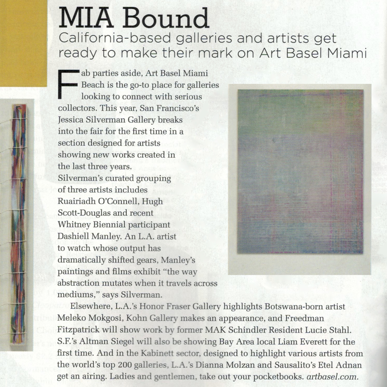